Problem
Why do so many people struggle to stay active?
Many people start exercising with good intentions, but maintaining a routine often becomes the real challenge. Existing fitness products typically focus on goals, streaks, and performance, yet many users still struggle with consistency.
Through this project, I wanted to understand what prevents people from staying active long-term and explore how a more flexible and supportive approach could help users build sustainable habits.
Solution
A fitness experience designed around flexibility and support
Flex Flow is a responsive fitness concept that adapts to users’ energy levels, schedules, and personal preferences. Instead of encouraging users to push harder, the experience focuses on helping them stay active in ways that feel achievable, realistic, and pressure-free.
The solution introduces flexible workout recommendations, low-energy alternatives, and supportive progress tracking designed to encourage consistency rather than perfection.
My Role
UX/UI Designer
I led the project from research to final UI design, including user interviews, synthesis, ideation, user flows, wireframing, visual design, and prototyping.
Timeline
8 Weeks
Research, synthesis, concept development, wireframing, UI design, and usability testing.
Tools
Research
Understanding the people behind the problem
Before exploring solutions, I wanted to better understand how people experience physical activity in everyday life. Rather than focusing on fitness performance, I was interested in what motivates people to start exercising, what makes them stop, and what helps them stay consistent over time.
To gather both industry and user perspectives, I conducted secondary research and five semi-structured interviews with participants from different backgrounds, lifestyles, and activity levels.
The research focused on three key questions:
- What motivates people to exercise?
- What causes them to stop?
- How can a fitness product support long-term consistency?
Secondary Research
Before speaking with users, I reviewed existing research on exercise behavior and habit formation.
The literature showed that while many people start fitness routines with strong intentions, maintaining consistency is significantly more difficult. Motivation often decreases over time, while flexibility and perceived autonomy increase the likelihood of long-term engagement.
These findings provided useful context, but I wanted to understand how these challenges appeared in real people’s lives.
Competitive Analysis
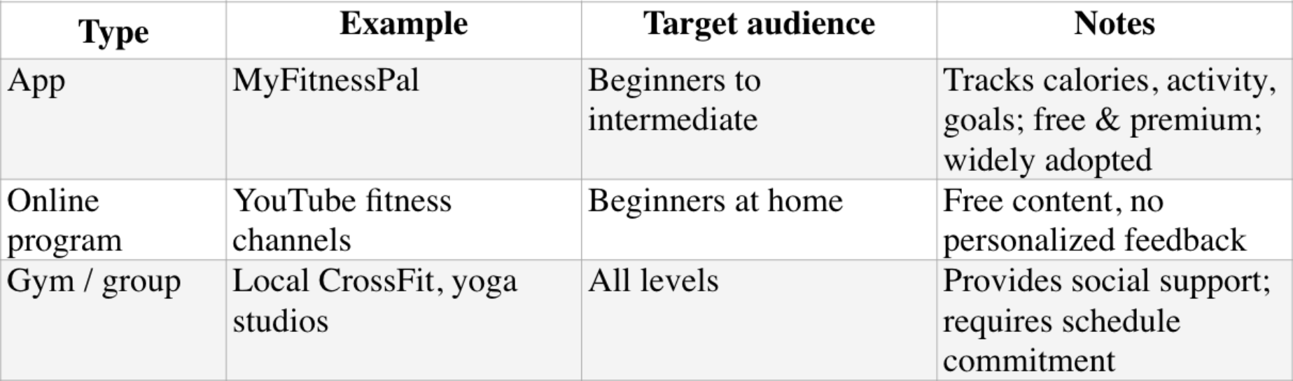
To better understand the market and identify potential gaps, I reviewed a range of existing fitness solutions, including apps, online programs, and group-based activities. The analysis highlighted strengths such as progress tracking and social support, while also revealing opportunities to create a more flexible and low-pressure fitness experience.
User Interviews
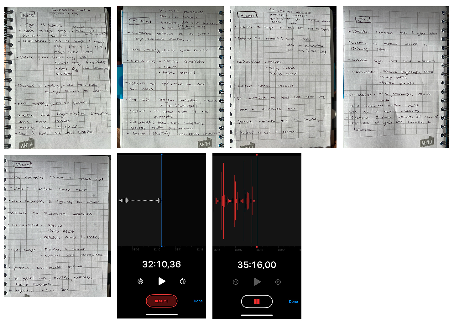
To better understand real experiences, I conducted five semi-structured interviews with participants of different ages, professions, and fitness backgrounds.
The goal was not to understand how often people exercise, but rather how exercise fits into their daily lives, what motivates them, and what prevents them from staying consistent.
Participants included:
- Regular exercisers
- Occasional exercisers
- Former exercisers
- People who preferred solo activities
- People motivated by social activities
Sample Interview Questions
What motivates you to exercise?
What challenges make it difficult to stay consistent?
How do you usually decide what type of activity to do?
Have you ever stopped exercising for a period of time? What contributed to that?
What kind of support would help you stay active more consistently?
Interview findings revealed several recurring patterns that became the foundation of the design direction.
Key Insights
After conducting interviews and reviewing the research findings, I synthesized the data to identify recurring patterns, motivations, and barriers. Using affinity mapping, I organized observations into broader themes, which helped uncover the most important user needs and opportunities. These insights were then translated into Point of View statements and How Might We questions that guided the design direction and solution development.
Affinity Mapping
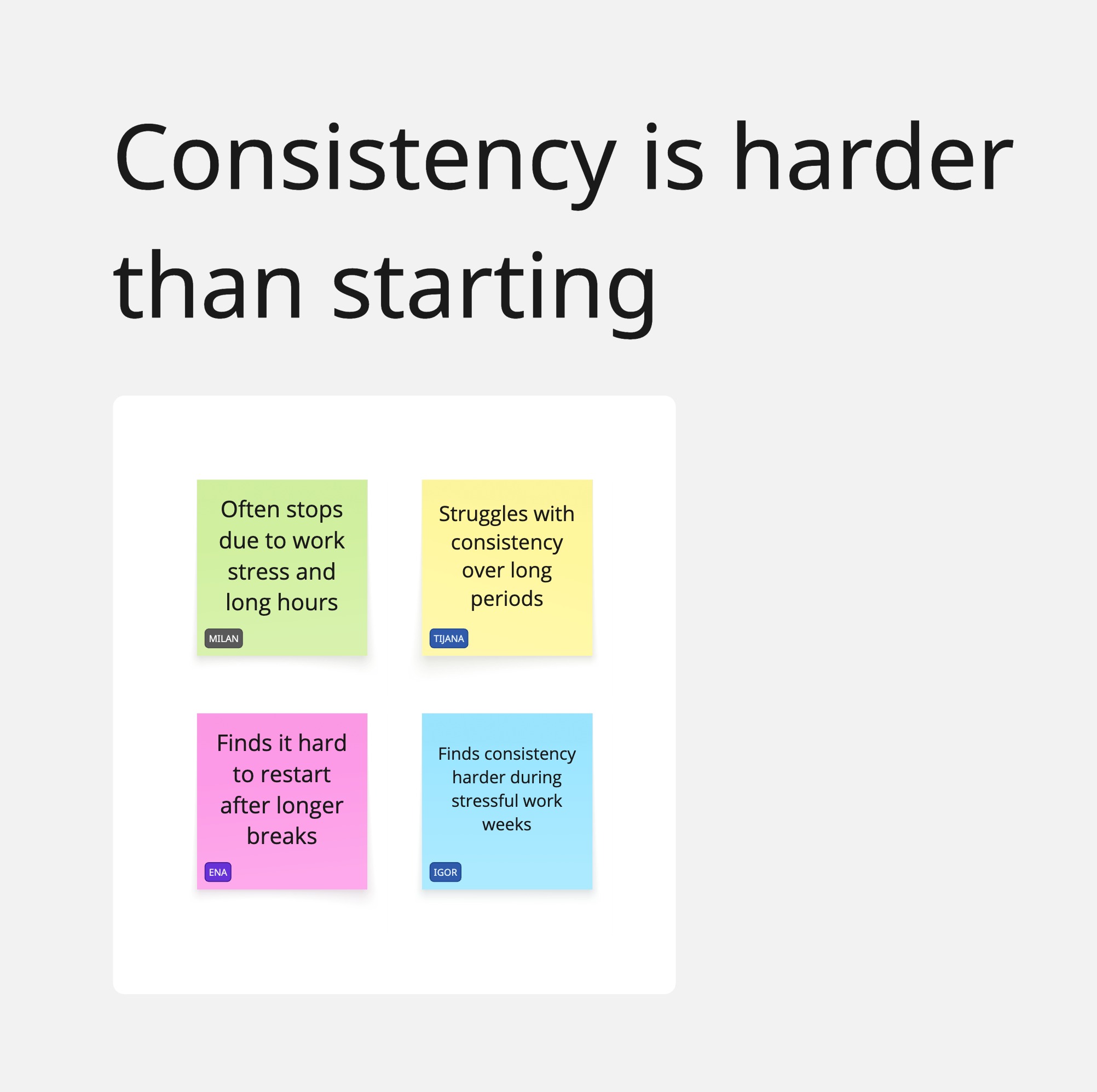
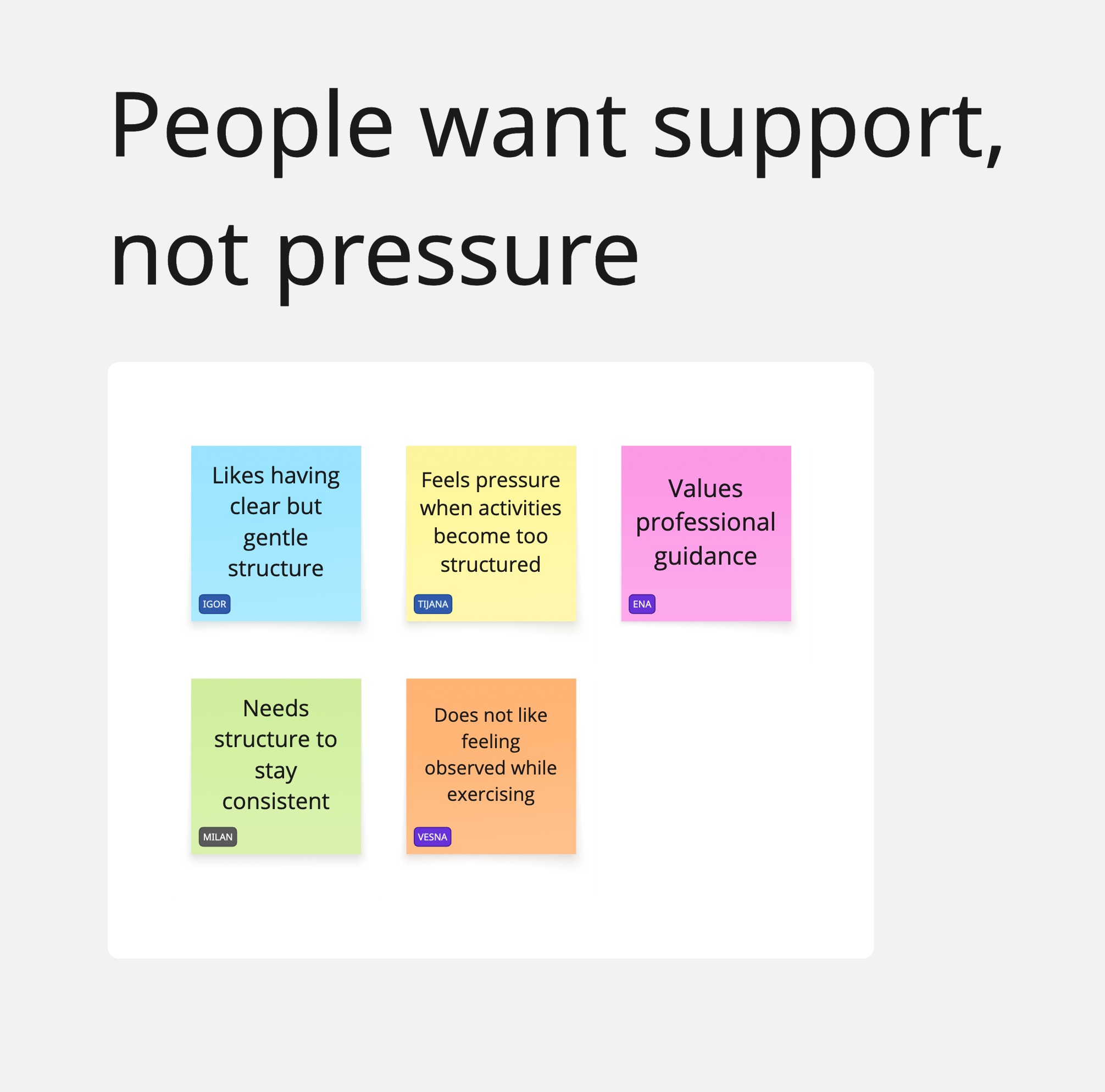
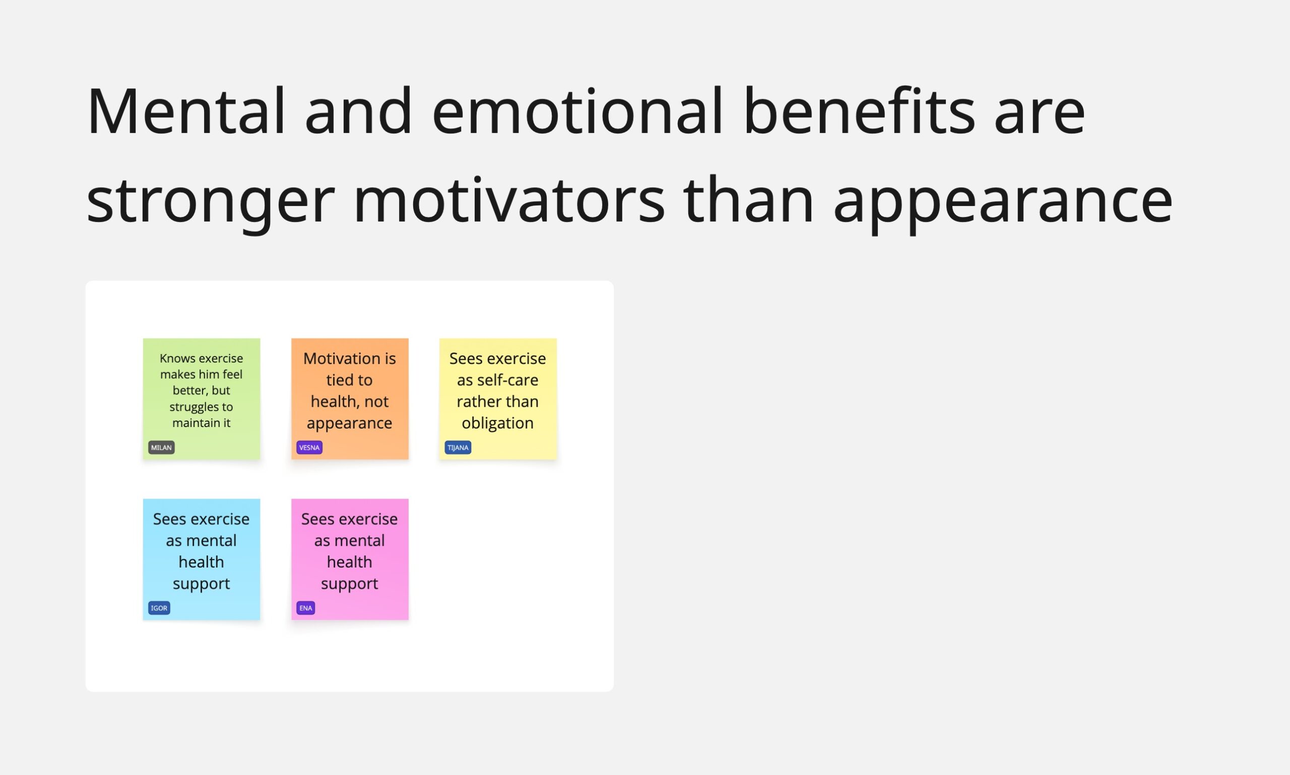
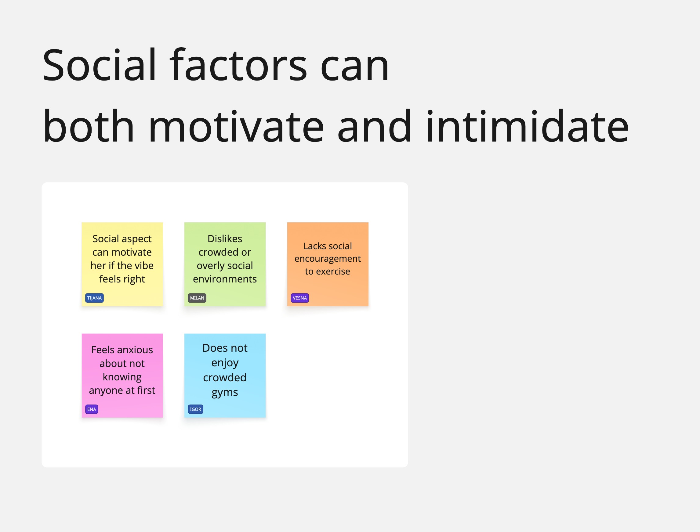
After synthesizing interview data, several themes consistently appeared across participants.
Consistency is harder than starting
Many participants had successfully started exercising before but struggled to maintain routines over time.
People want support, not pressure
Users responded better to encouragement and flexibility than to strict goals or accountability systems.
Emotional benefits matter more than appearance
Participants frequently mentioned feeling better, reducing stress, and improving mental well-being as key motivations.
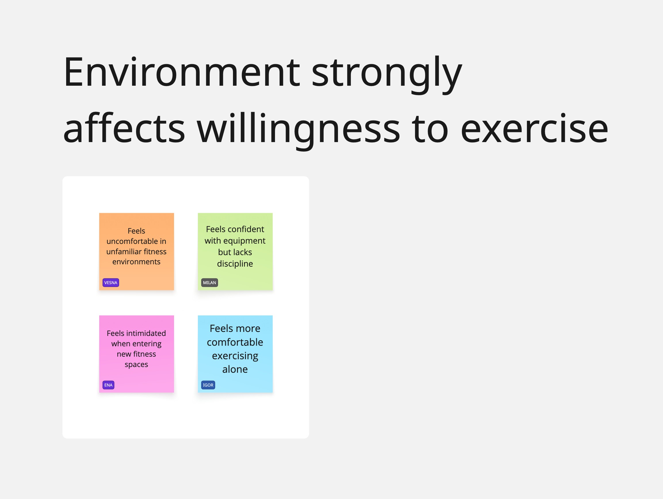
Social environments can motivate or intimidate
Some users enjoyed group activities, while others actively avoided them.
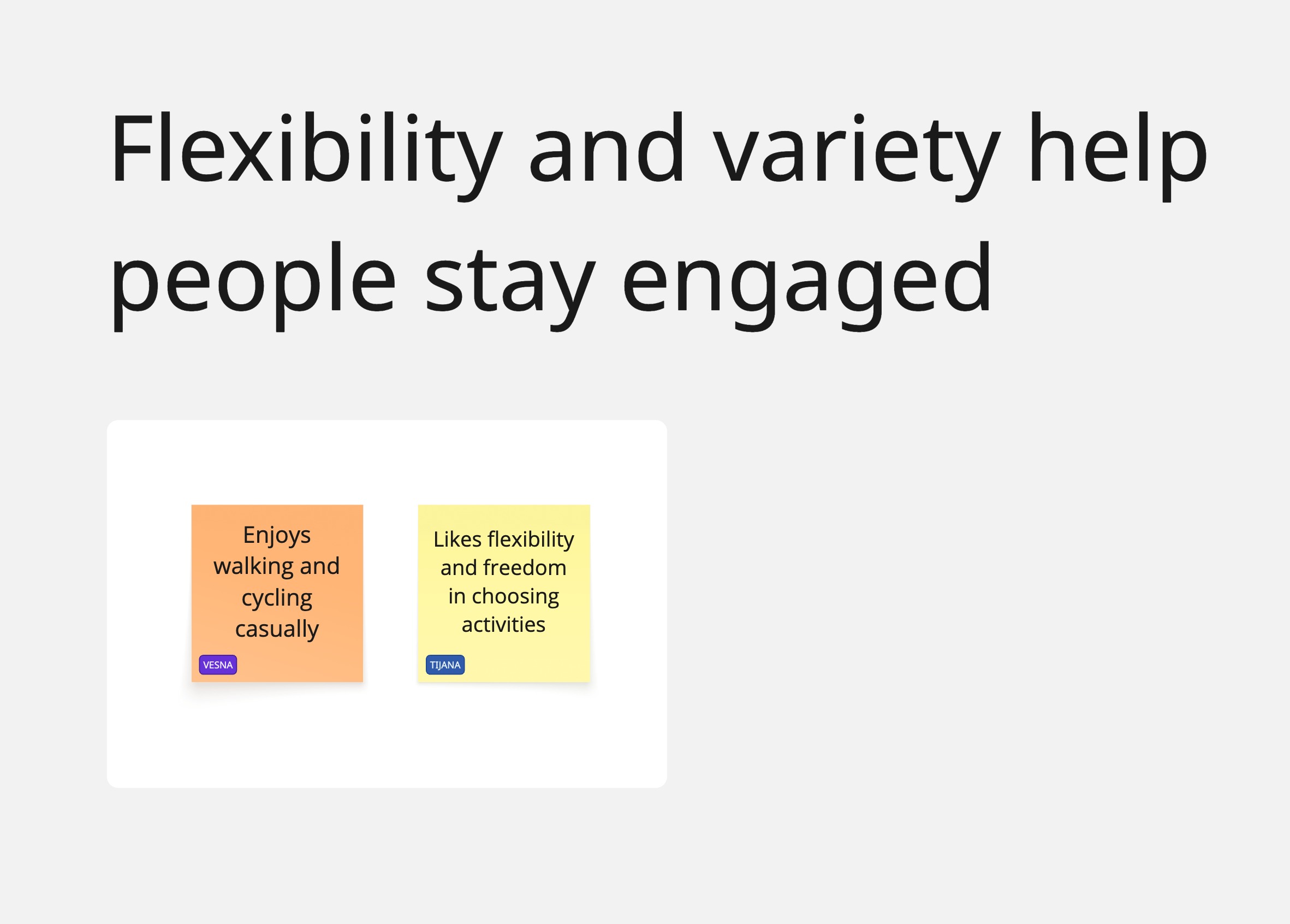
Flexibility increases engagement
Participants wanted options that could adapt to changing schedules, energy levels, and life circumstances.
Point Of View Statements
POV 1:
I’d like to explore ways to help adults who start exercising with motivation but struggle to stay
consistent over time, because maintaining routines feels harder than beginning and flexibility
and variety play a key role in whether people keep going or stop altogether.
POV 2:
I’d like to explore ways to help people feel supported in their physical activity without feeling
pressured, because overly rigid expectations or self-imposed rules can turn exercise into a
source of stress rather than something sustainable.
POV 3:
I’d like to explore ways to help adults feel more comfortable engaging in physical activity in
different environments, because social settings and unfamiliar environments can either
motivate them or intimidate them enough to avoid exercising altogether.
How Might We Questions
Consistency + Flexibility
HMWs Derived from POV 1
How might we help people stay
physically active over time
without relying on strict
routines?
How might we support
consistency while allowing
flexibility when motivation or
circumstances change?
How might we help people re-
engage with exercise after
breaks without feeling
discouraged?
Support vs. Pressure
HMWs Derived from POV 2
How might we make people
feel supported in their activity
without creating pressure or
guilt?
How might we help people
define progress in ways that
feel encouraging rather than
demanding?
How might we reduce the
feeling that exercise is
something people are “failing
at”?
Social & Environment
HMWs Derived from POV 3
How might we help people feel
more comfortable starting
physical activity in unfamiliar
or social environments?
How might we support people
who prefer exercising alone
without making them feel
isolated?
How might we design
environments that feel
welcoming regardless of
fitness level or experience?
Personas
Understanding the Users
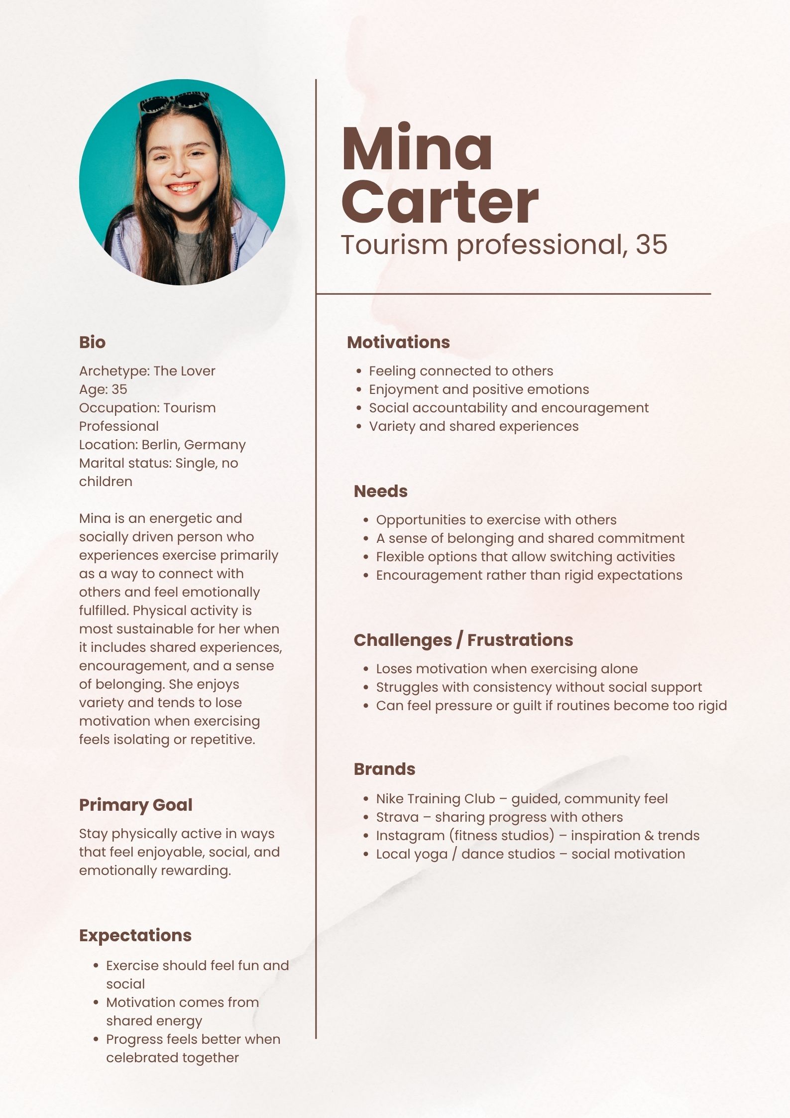
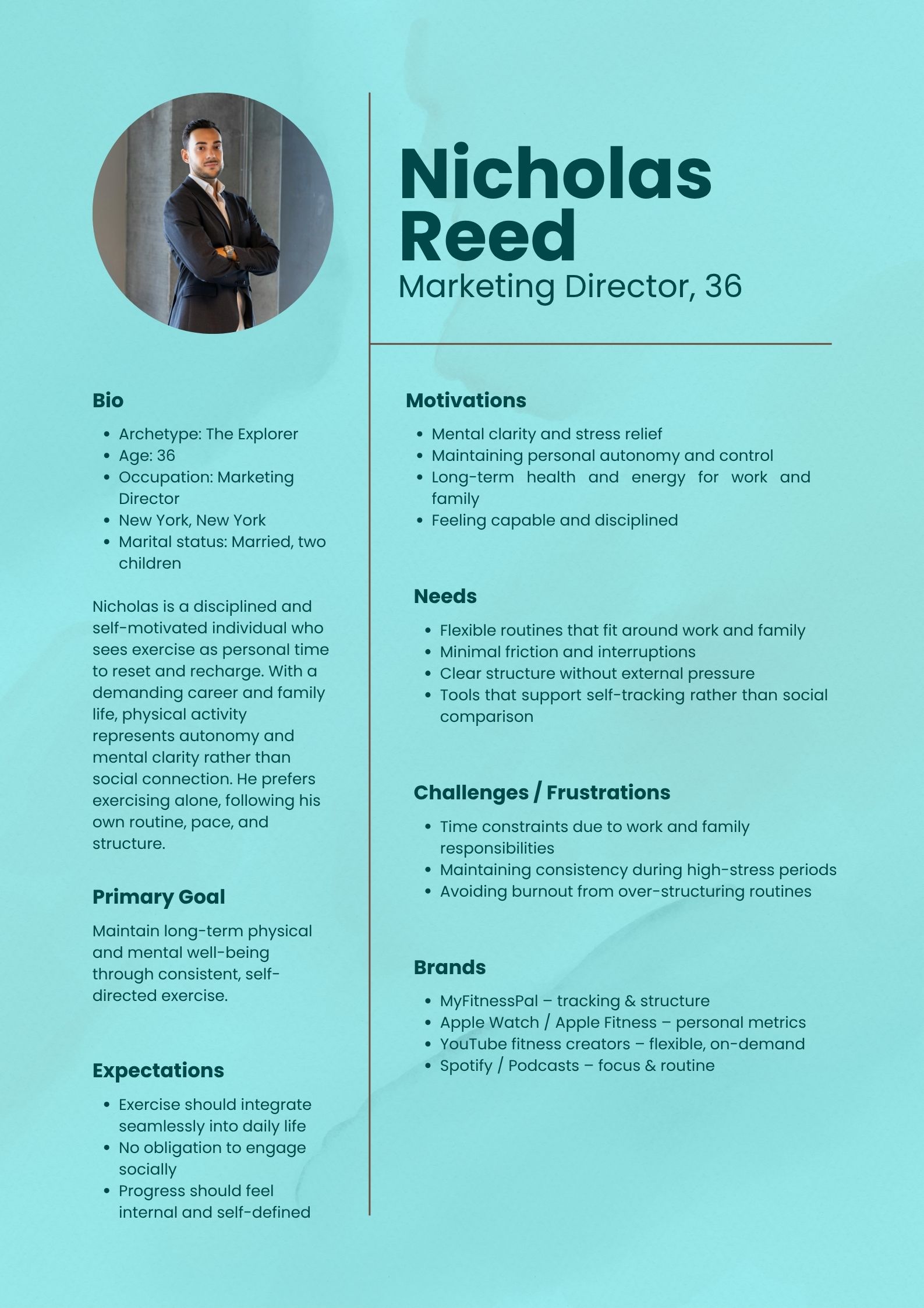
While the interviews revealed several shared challenges, they also highlighted important differences in motivations, preferences, and exercise habits. To keep these insights visible throughout the design process, I created two personas that represent the primary user groups identified during research.
One persona reflects users who enjoy variety, social interaction, and flexibility, while the other represents users who prefer structure, efficiency, and independent workouts. Together, they helped guide feature prioritization and design decisions throughout the project.
Information Architecture
Organizing Content Around User Needs
Once I had a clearer understanding of user goals and behaviors, I focused on structuring the product in a way that felt intuitive and easy to navigate.
Insights from research showed that users wanted quick access to activities, clear progress tracking, and supportive guidance without unnecessary complexity. Before defining the structure, I conducted a card sorting exercise to better understand how users naturally grouped information and what navigation patterns felt most familiar to them.
Card Sorting
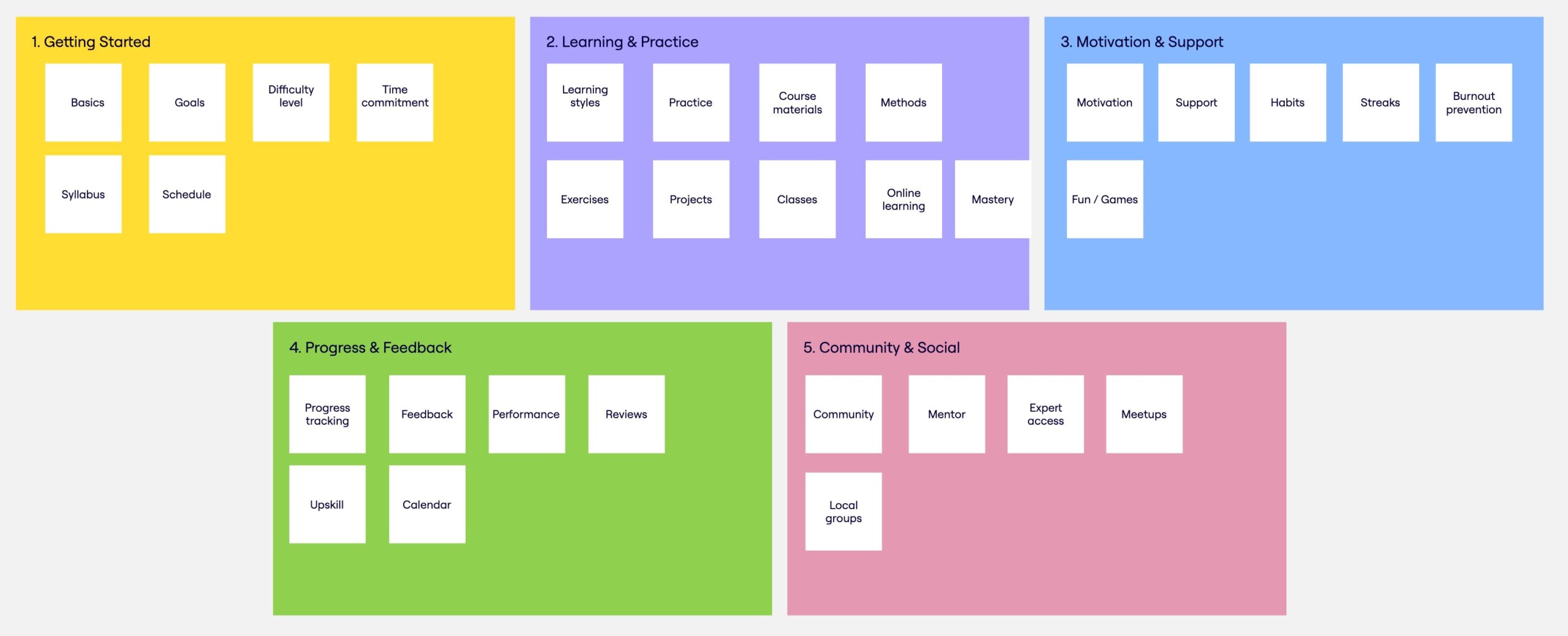
To validate assumptions about content organization, I conducted a closed card sort with four participants from the target audience. Participants were asked to organize content into predefined categories and explain their reasoning.
The exercise helped reveal how users expect information to be grouped and highlighted areas where labels or categories could create confusion.
What I Learned
Several patterns emerged during the exercise:
- Users showed strong agreement around core sections such as Getting Started, Progress, Learning, and Community.
- More than 40% of items achieved complete consensus, indicating that the overall structure aligned well with users’ mental models.
- Some content, including habits, schedules, and streaks, overlapped between categories, suggesting the need for clearer naming and navigation cues.
These findings helped refine the information architecture before moving into flows and screen design.
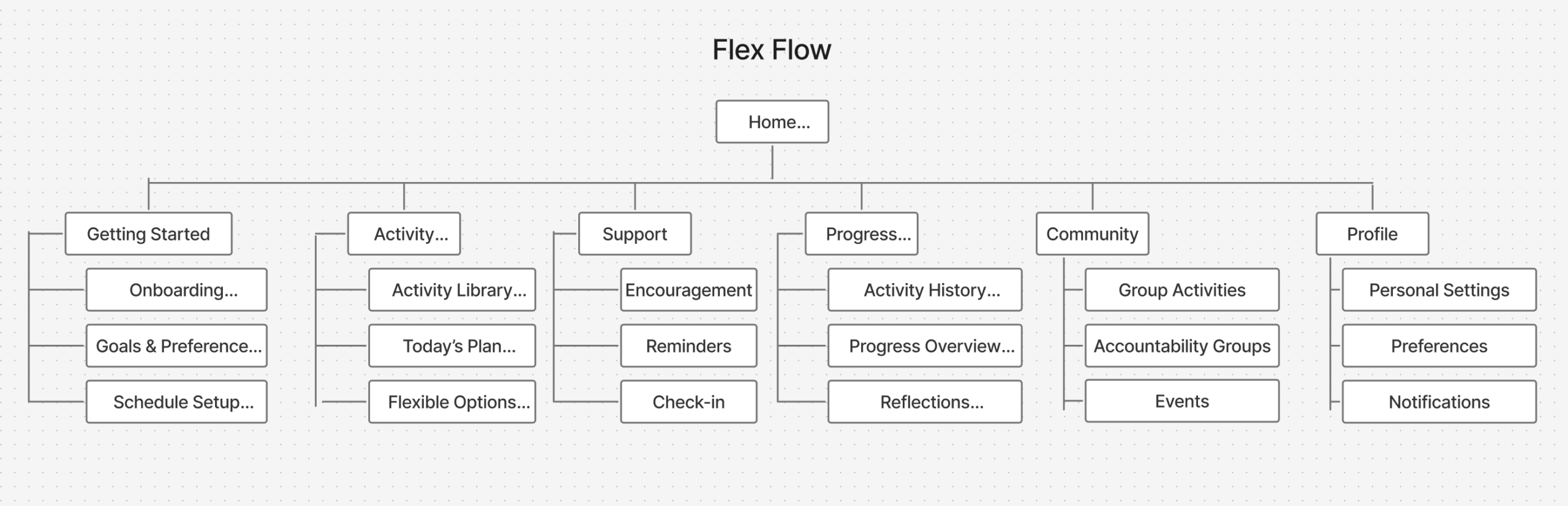
Information Architecture
Based on the card sorting results and research insights, I developed an information architecture that prioritizes simplicity, flexibility, and quick access to key actions.
The structure was designed to support users regardless of their motivation level, making it easy to discover activities, receive support, and track progress without friction.
Core Flows
Mapping the Experience
Before moving into interface design, I mapped the core journeys users would take through the product. The goal was to understand how different user states would affect navigation and decision-making.
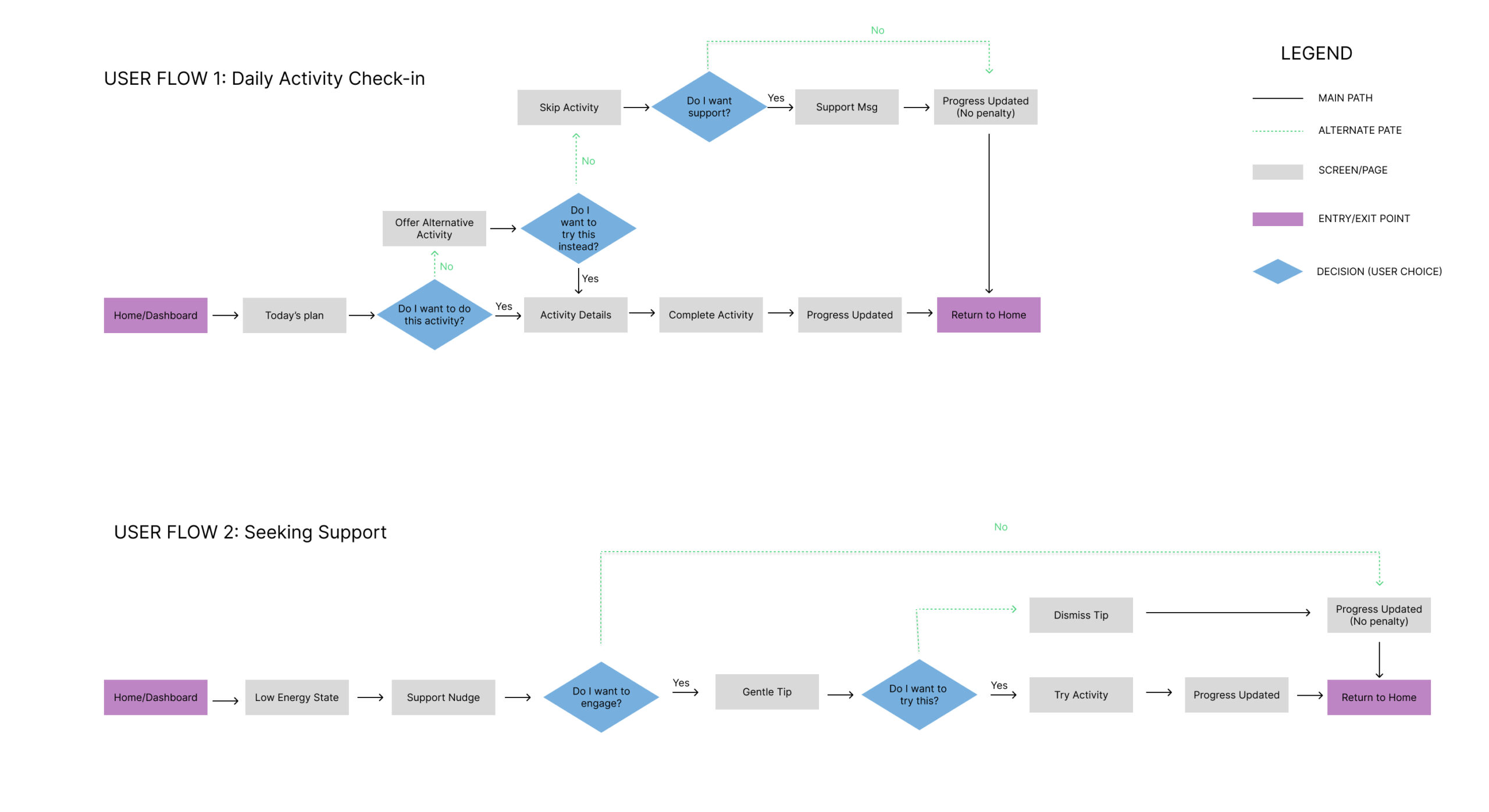
Research revealed that not every user approaches exercise with the same level of motivation or energy. Because of this, I designed two primary paths through the experience: a standard workout flow and an alternative low-energy flow that provides support during moments of reduced motivation.
The experience supports two primary scenarios:
Regular Flow
For users who feel ready to exercise and want a structured workout experience.
Low-Energy Flow
For users who still want to stay active but may lack energy, motivation, or time.
Designing for both scenarios allowed the experience to adapt to real-life circumstances rather than expecting users to follow a rigid routine.
User Flows
I created user flows to visualize the complete journey through both scenarios and identify key decision points. These diagrams helped define how users move between activities, support features, and progress tracking while ensuring that each path remained clear and intuitive.
Task Flows
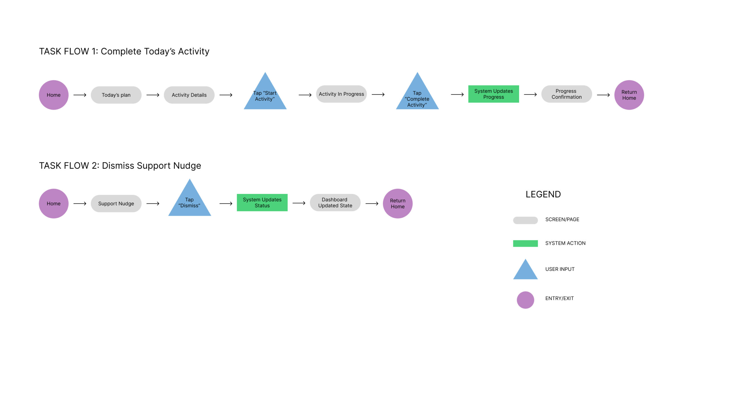
After defining the overall journeys, I mapped task flows for critical interactions such as completing an activity and dismissing a support prompt.
Breaking these actions into smaller steps helped simplify interactions, reduce cognitive load, and identify potential friction before moving into wireframes.
Design Exploration
Turning insights into concepts
With the user flows defined, I began exploring how the experience could look and feel in practice. My goal was not to design screens immediately, but to test different approaches to supporting users with varying energy levels and motivation.
The early concepts focused on reducing pressure, offering flexibility, and helping users stay active without feeling overwhelmed. These ideas were first explored through sketches before moving into digital wireframes.
Early Sketches
Exploring the main user journey
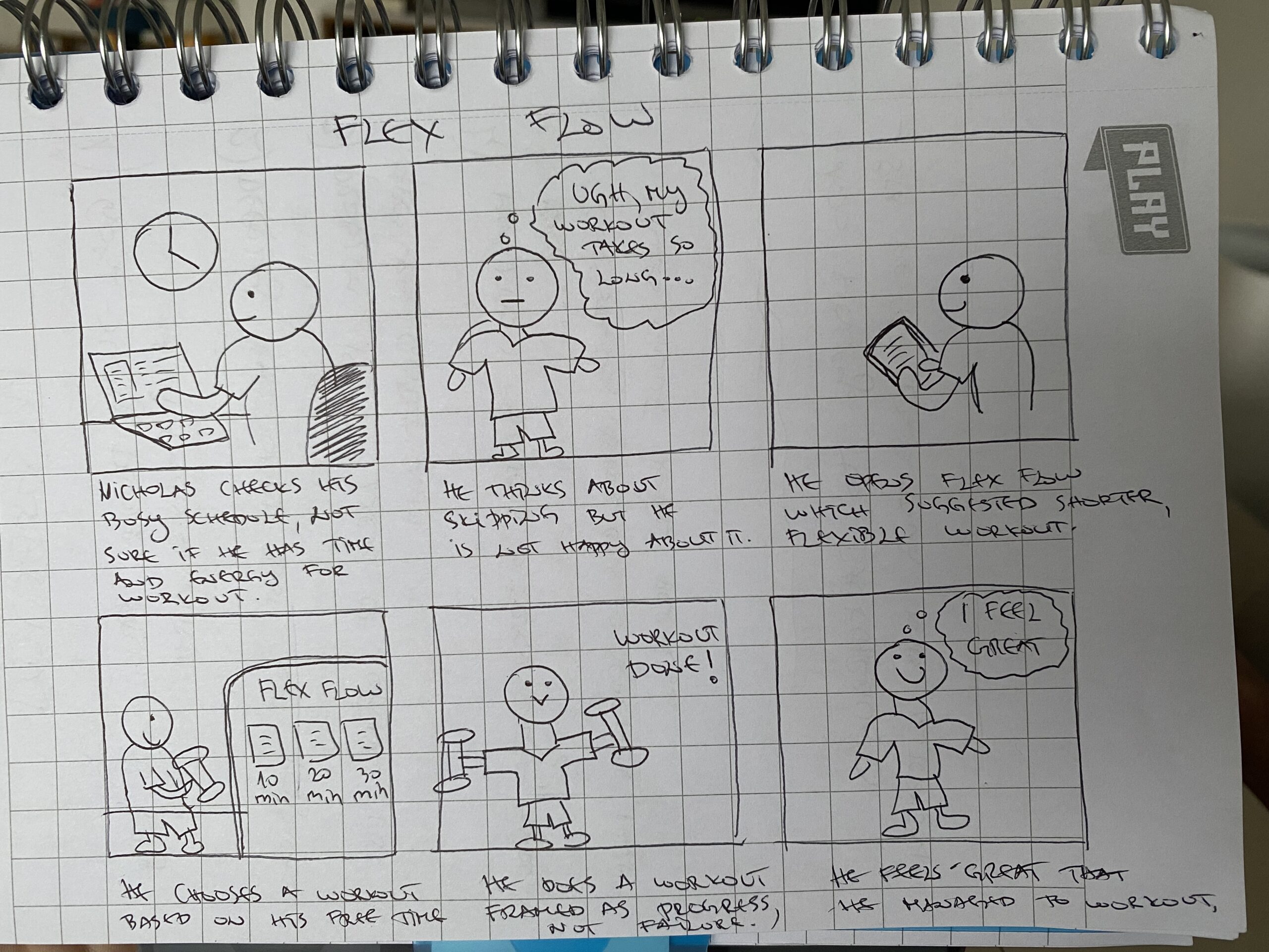
One of the first concepts focused on users who want to exercise but struggle to fit workouts into busy schedules.
This storyboard explored how the product could adapt workout recommendations based on available time instead of expecting users to commit to a fixed routine. The idea emerged directly from interview findings, where several participants mentioned that consistency was often disrupted by work, travel, or lack of time.
The concept helped validate the idea that flexibility could become a core differentiator of the experience.
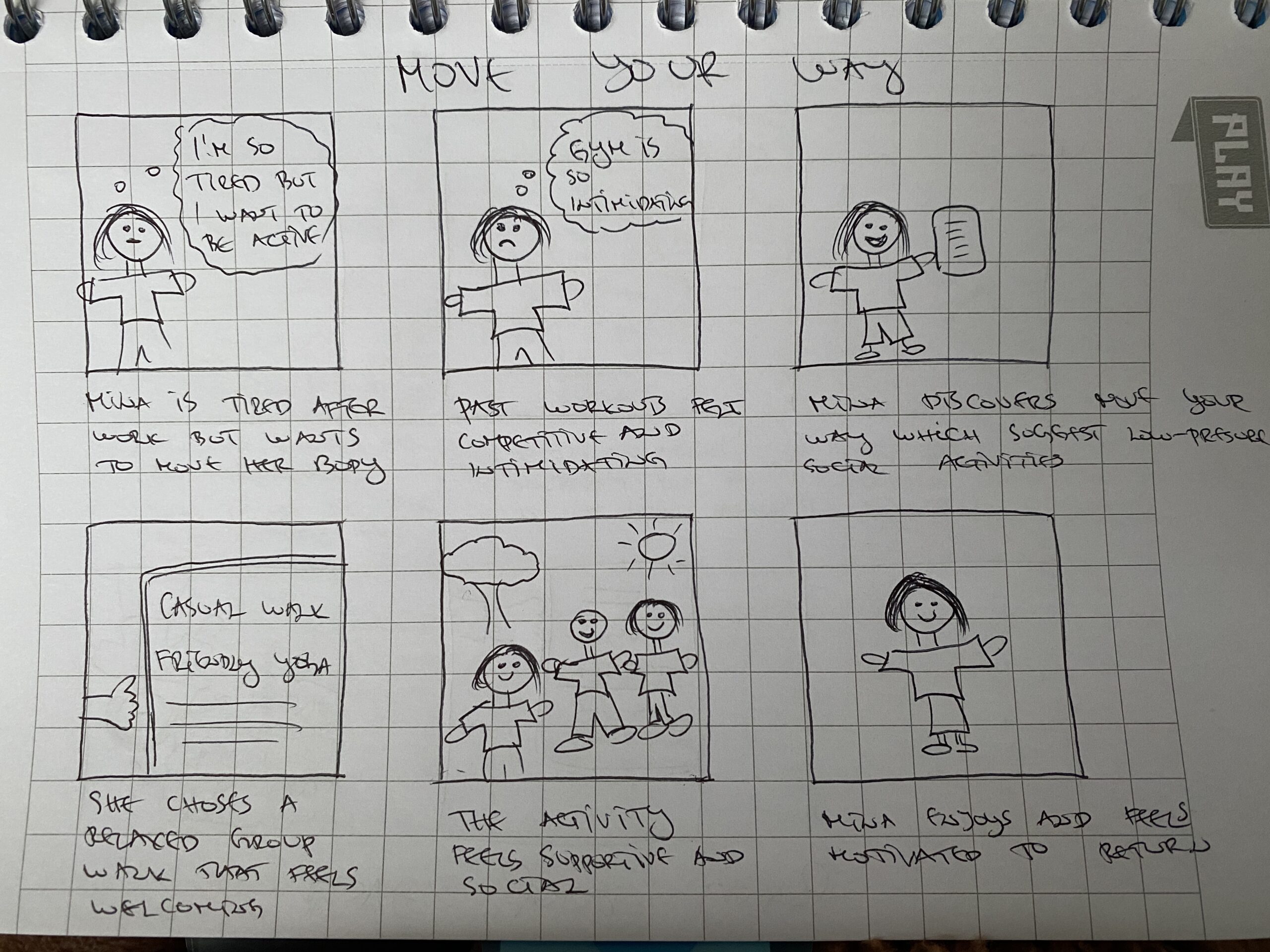
Alternative Journey Exploration
Designing for low motivation
While some users wanted structure, others described feeling intimidated by traditional fitness environments or pressured by highly competitive workout apps.
This storyboard explored an alternative path where users receive supportive suggestions based on their current energy level instead of being pushed toward intense exercise.
The exercise helped define one of the project’s key principles:
Support users where they are instead of where they think they should be.
Wireframes
Translating concepts into structure
After validating the core ideas through sketches, I moved into digital wireframes to define layout, hierarchy, and user interactions.
The focus during this phase was creating a simple flow that minimizes decision fatigue while keeping users motivated and informed throughout the experience.
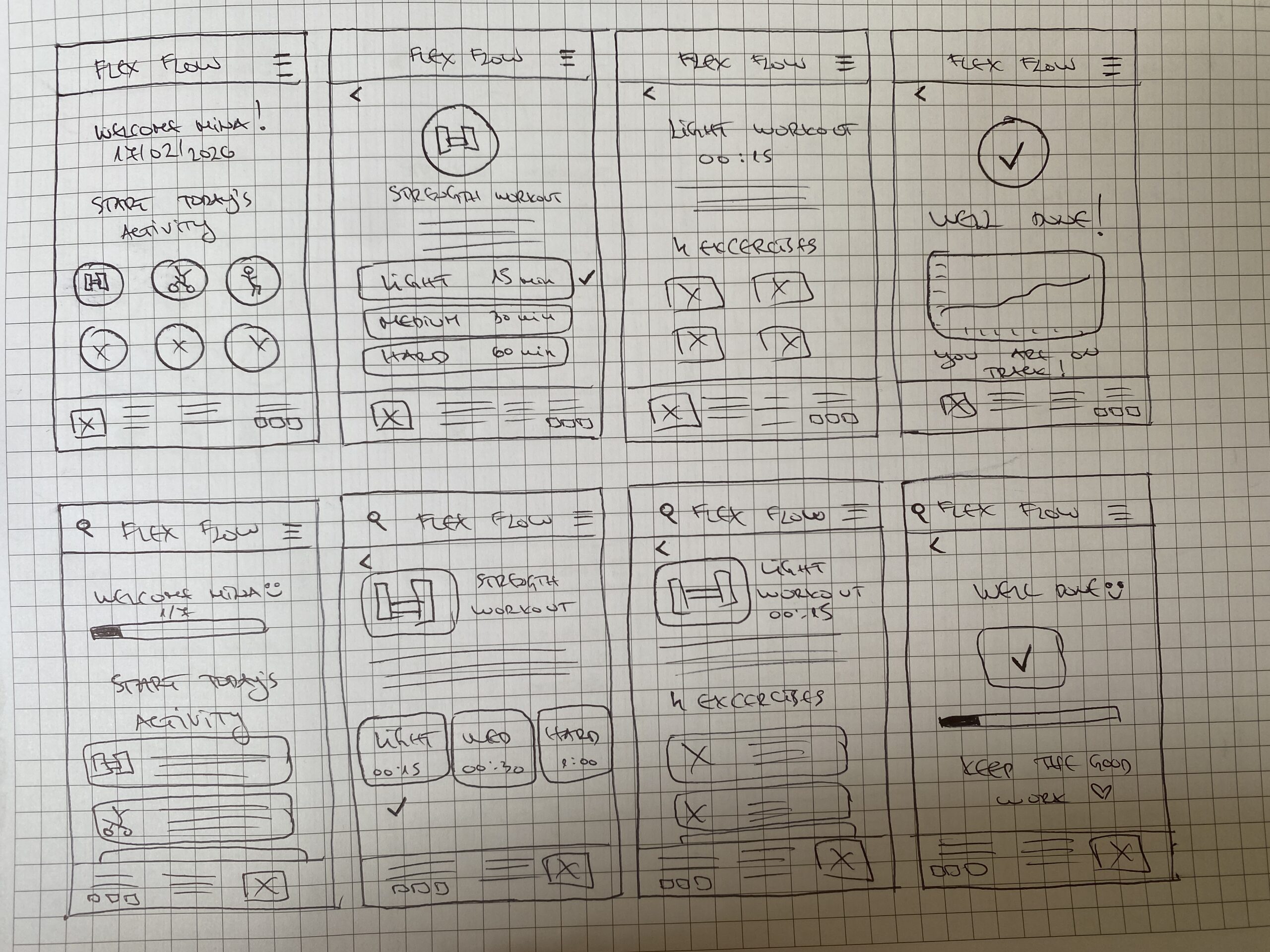
Low-Fidelity Wireframes
Establishing the structure
The low-fidelity wireframes focused on defining the overall layout, information hierarchy, and user journey before introducing visual design elements.
At this stage, I explored different ways of presenting activities, progress tracking, and supportive guidance while keeping the experience simple and easy to navigate.
Working in low fidelity allowed me to quickly test ideas and make structural changes without becoming attached to visual details too early in the process.
Mid-Fidelity Wireframes
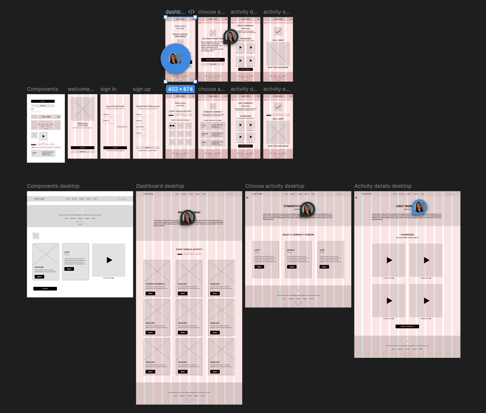
Refining interactions and content
After validating the overall structure, I moved into mid-fidelity wireframes to refine content placement, screen hierarchy, and interaction patterns.
This phase helped me evaluate how users would move through the experience and whether key actions were clear and easy to complete.
I also started defining:
- Screen layouts
- Navigation patterns
- Content hierarchy
- Button placement
- Progress indicators
- Supportive messaging
Moving into mid fidelity revealed several areas where the experience could be simplified and made more intuitive.
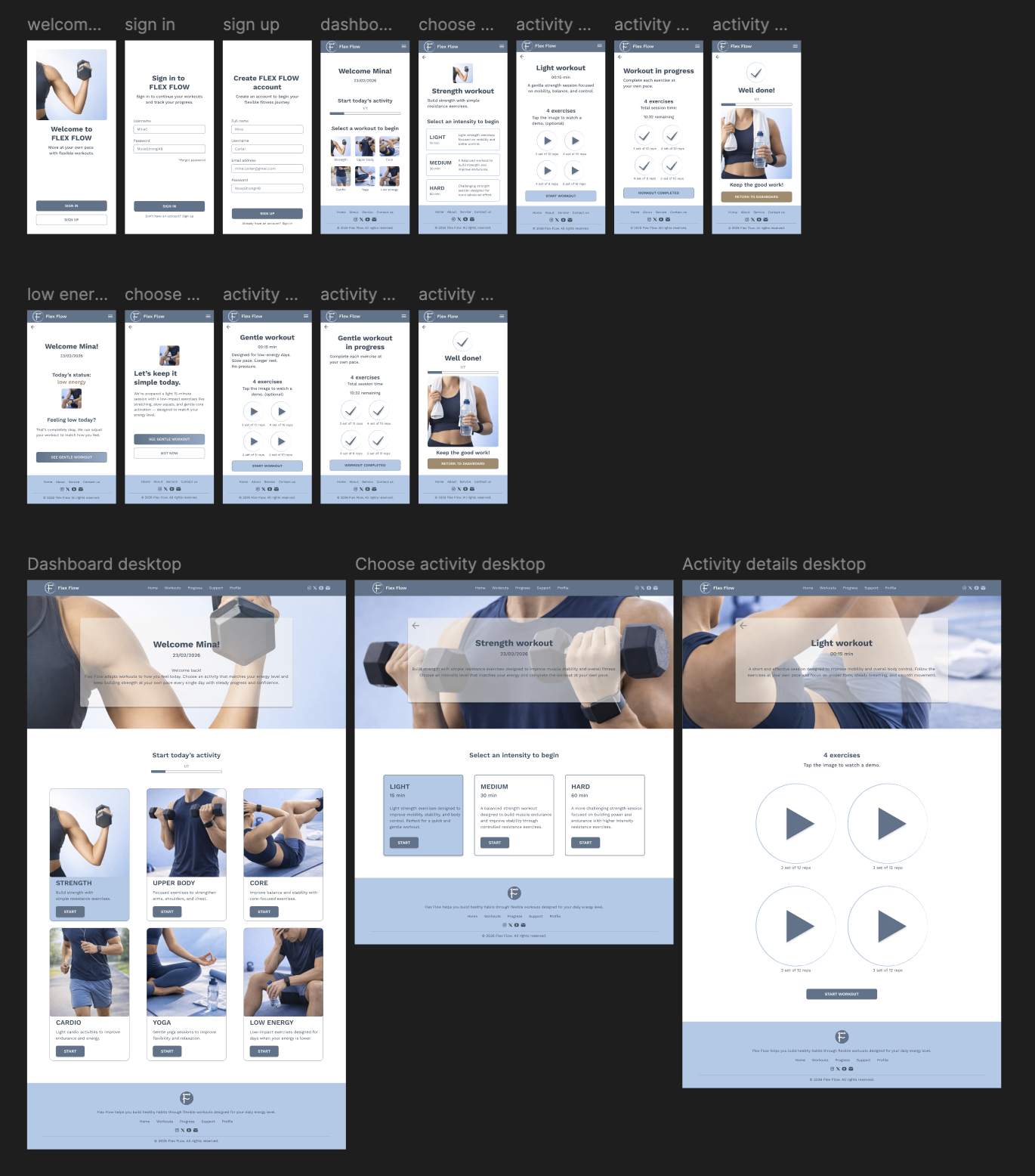
Because Flex Flow was designed as a responsive experience, I explored both mobile and desktop layouts early in the process. This helped ensure that key content, navigation patterns, and interactions could scale effectively across different screen sizes while maintaining a consistent user experience.
Mid-Fidelity Usability Testing
I conducted usability testing with 3 participants representing different exercise habits and levels of experience with fitness products.
Participants were asked to complete several core tasks:
Start a workout session
Complete a workout
Navigate the low-energy support flow
Return to the dashboard after completing an activity
The goal was to evaluate navigation clarity, task completion, and overall usability before moving into high-fidelity designs.
What Changed
Several adjustments were made during this stage:
- Reduced the amount of information displayed on key screens.
- Improved visual hierarchy to make primary actions easier to identify.
- Simplified navigation and removed unnecessary elements.
- Clarified workout selection options.
- Improved the visibility of progress and completion states.
These changes helped create a smoother experience before moving into high-fidelity design.
Visual Direction
Defining the product personality
Before moving into high-fidelity design, I explored visual directions that would support the product’s goals and values.
Research showed that users were looking for encouragement, flexibility, and balance rather than competition or performance pressure. Because of this, the visual identity needed to feel calm, approachable, and supportive.
Brand Values
The research and ideation process revealed four core values that guided the product experience.
Flexibility
Supporting different schedules, energy levels, and workout preferences.
Support
Encouraging movement without creating guilt or pressure.
Simplicity
Making activities and navigation easy to understand and complete.
Well-being
Focusing on sustainable habits rather than performance metrics.
These principles influenced both the functionality and visual design of the final product.
Brand Identity
Creating a calm and supportive experience
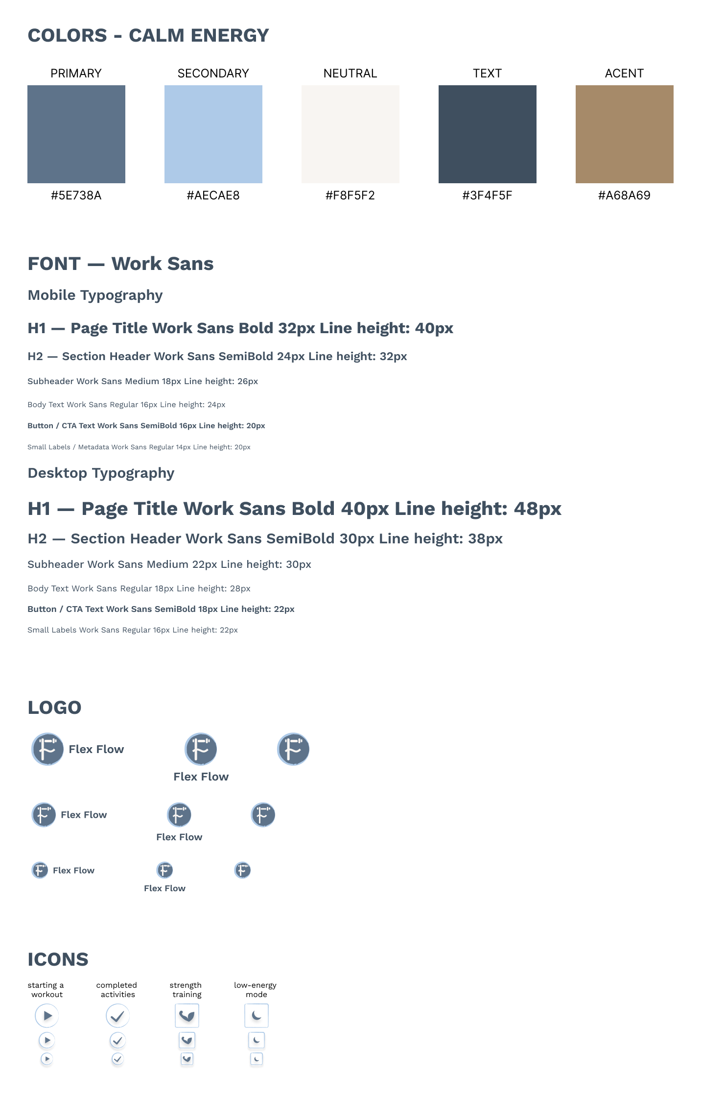
The visual identity was designed to reflect the product’s core values and create a more approachable alternative to traditional fitness applications.
Muted colors, clean typography, and minimal layouts were used to reduce pressure and create a balanced experience that feels welcoming regardless of a user’s fitness level or experience.
The overall direction aimed to support consistency and well-being rather than competition and performance.
High-Fidelity Design
Bringing the experience to life
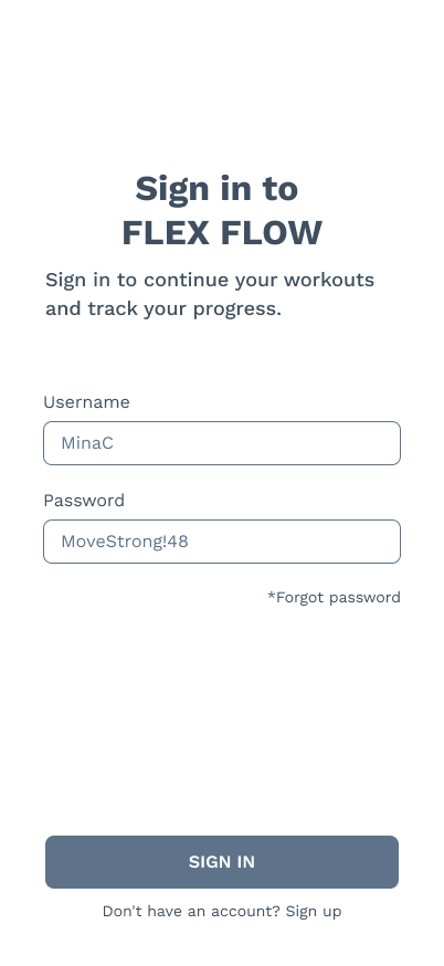
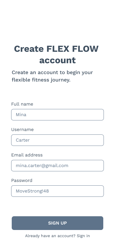
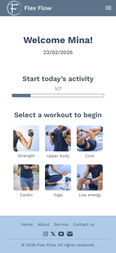
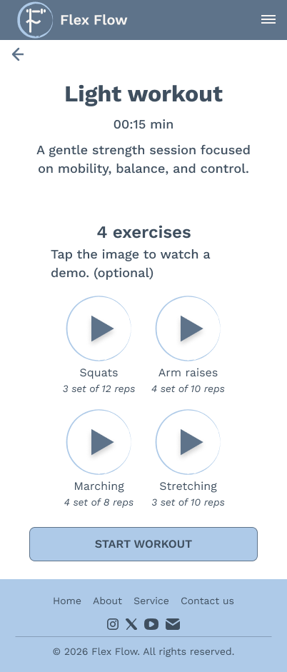
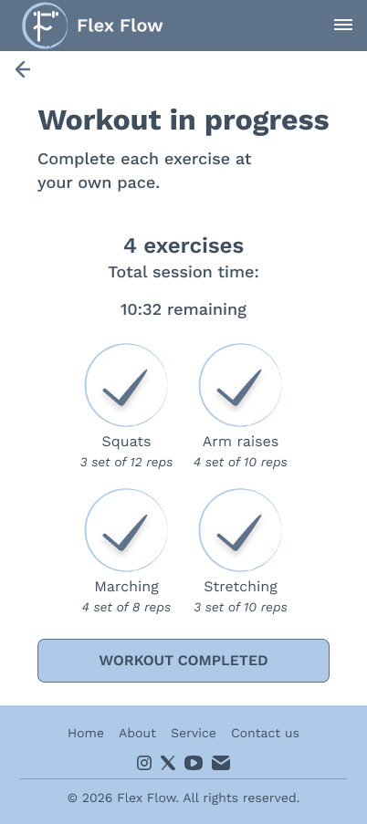
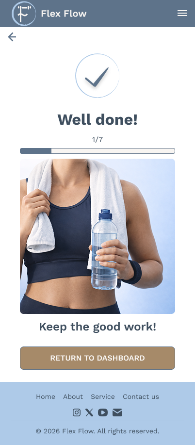
With the visual direction established, I translated the wireframes into a polished interface and applied the design system across key user journeys.
The goal was to create an experience that feels approachable, intuitive, and supportive while maintaining visual consistency throughout the product.
Final Interface
The final interface was designed to:
- Reduce decision fatigue
- Encourage consistency
- Support different energy levels
- Maintain clarity throughout the experience
Special attention was given to hierarchy, spacing, and content organization to ensure users could quickly understand available actions and move through the product with confidence.
Responsive Experience
Designing beyond mobile
Although Flex Flow was primarily designed as a mobile experience, responsive layouts were explored to ensure scalability across different devices.
The responsive approach allows users to access content more comfortably on larger screens while preserving the simplicity and flexibility of the mobile experience.
High-Fidelity Usability Testing
I conducted usability testing with 5 participants representing different fitness habits and experience levels. The goal was to evaluate navigation clarity, task completion, and overall usability of the final designs.
Participants were asked to complete core tasks such as selecting a workout, navigating the low-energy support flow, and completing an activity session.
The testing confirmed that users could successfully complete all key flows without assistance, while also revealing several opportunities to improve clarity and reduce hesitation at specific decision points.
Testing Results
Participants successfully completed all primary tasks without assistance, confirming that the overall structure and navigation were intuitive.
While task completion rates were high, testing revealed several moments of hesitation and uncertainty that presented opportunities for improvement.
Iterations
Improving clarity through feedback
User feedback helped identify areas where additional guidance and context were needed.
Several improvements were implemented to reduce confusion, increase confidence, and make decision-making easier throughout the experience.
Key Improvements
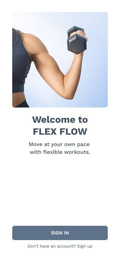
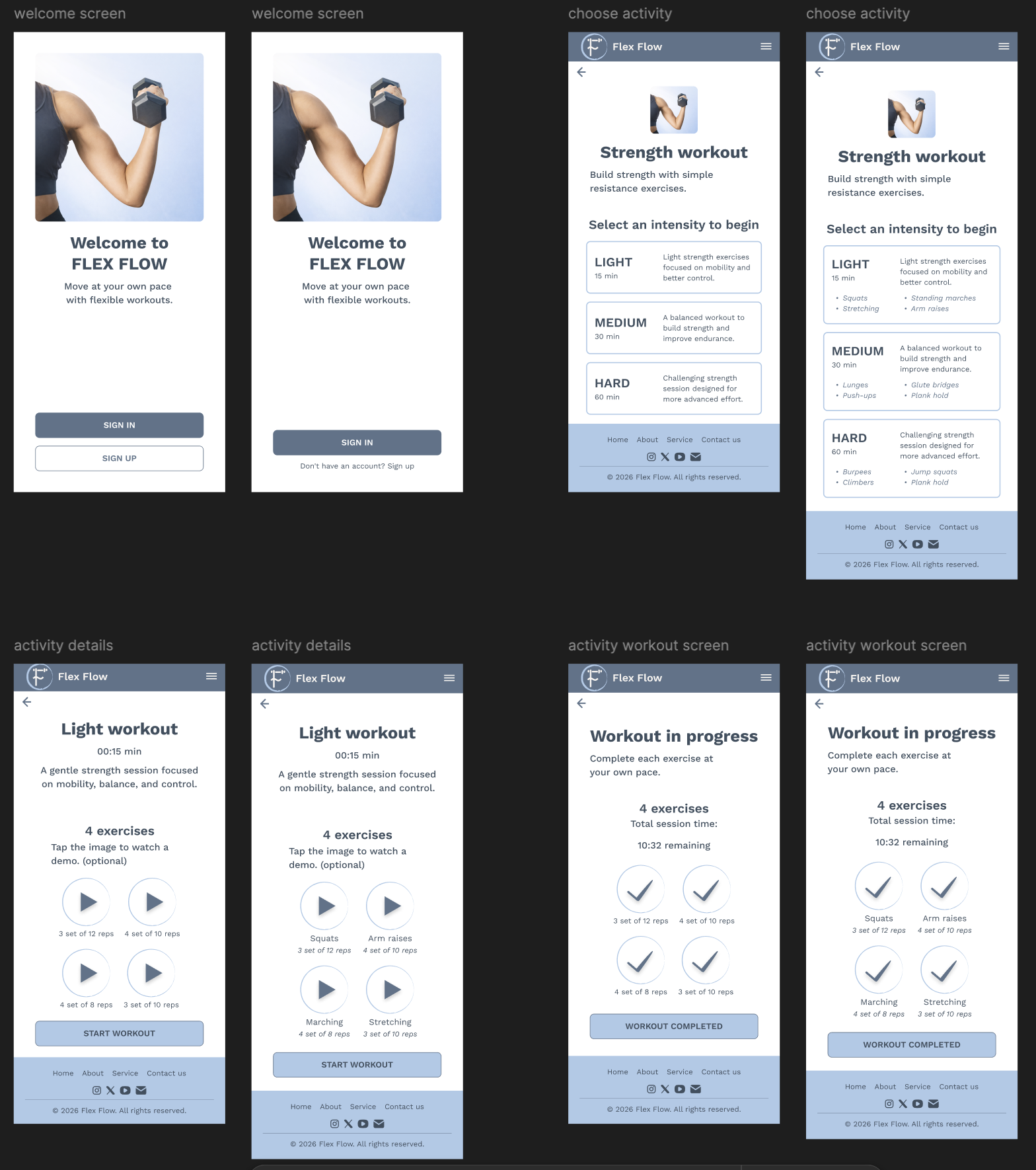
Onboarding Clarity
Improved hierarchy and context to better distinguish sign-in and sign-up actions.
Intensity Selection
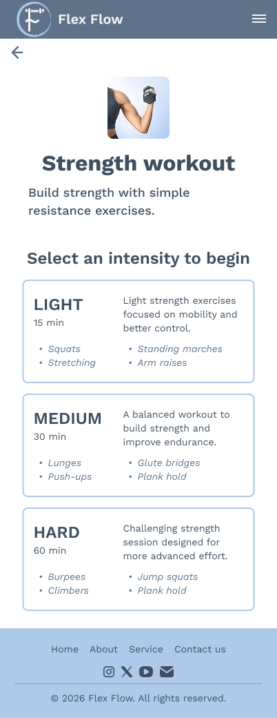
Added clearer descriptions and exercise previews to help users make informed decisions.
Workout Clarity
Introduced exercise labels within workout sessions to improve orientation and reduce uncertainty.
These refinements helped create a more intuitive and supportive experience.
Before & After
The iteration process focused on reducing hesitation and improving clarity at key decision points.
By addressing issues identified during testing, the final experience became easier to navigate and more aligned with user expectations.
These improvements strengthened both usability and overall confidence throughout the product journey.
Impact
Measuring the outcome
The final design successfully addressed several usability issues identified during testing and improved the clarity of key interactions.
The low-energy support concept received particularly positive feedback from participants, validating the project’s core hypothesis that flexibility and encouragement can be more effective than pressure-based approaches.
The result is a fitness experience that feels more accessible, supportive, and adaptable to real-life circumstances.
Reflection
This project helped me better understand how deeply habits, emotions, and everyday routines influence user behavior.
Throughout the process, I learned that designing for motivation is not only about helping users achieve goals, but also about helping them feel comfortable returning after breaks, stress, or low-energy periods.
One of the most valuable parts of the project was seeing how research insights directly shaped the product direction. Instead of building a traditional fitness experience centered around performance and pressure, I was able to create a concept focused on flexibility, support, and realistic behavior patterns.
More than anything, this project strengthened the way I approach UX design — by listening closely to users, understanding the emotional side of experiences, and designing solutions that feel both useful and genuinely human.