Problem
Netflix offers thousands of movies and TV shows, but that abundance often creates decision fatigue. Many users open the app without knowing exactly what they want to watch and spend more time browsing than actually watching. Existing discovery methods rely heavily on genres and categories, making it difficult for users who only know how they want to feel.
Solution
I designed Pick for My Mood, a feature that recommends movies and TV shows based on the user’s current mood rather than genres.
Users simply select how they want to feel, optionally refine their preferences, and instantly receive personalized recommendations. By integrating seamlessly into Netflix’s existing design language, the feature helps reduce browsing time while preserving the familiar Netflix experience.
My Role
UX/UI Designer
Responsible for the end-to-end design process, from user research and problem definition to wireframing, UI design, interactive prototyping, and usability testing.
Timeline
4 Weeks
Tools
4 Main Tools
Figma
Research
To better understand the challenges users face when choosing what to watch, I explored existing streaming experiences and gathered insights from potential users. The research included secondary research, competitive analysis, and user interviews, helping me build a clearer understanding of user needs and identify opportunities to improve content discovery.
These findings informed the next steps of the design process, from defining the problem to shaping a more personalized viewing experience.
Secondary Research
Before conducting user interviews, I explored existing research on streaming behavior, content discovery, and decision fatigue. I reviewed industry reports, UX articles, and competitor features to better understand how users navigate large content libraries and what challenges they face when choosing something to watch.
The research revealed that while streaming platforms offer an extensive selection of content, the abundance of choices can often make decision-making more difficult. These insights helped validate the problem space and informed the questions I asked during user interviews, ensuring the design process was grounded in both existing research and real user experiences.
SWOT Competitive Analysis
As part of my secondary research, I conducted a SWOT analysis of three digital platforms—Disney+, Spotify, and TikTok—to better understand how leading products approach personalization, content discovery, and user engagement. While these platforms serve different purposes, each offers valuable insights into recommendation systems and the ways users discover content.
The analysis highlighted opportunities to make content discovery more personalized and intuitive. Disney+ showed the limitations of discovery centered on popular franchises and genres, while Spotify demonstrated the potential of mood-based recommendations and TikTok highlighted the role of personalized content feeds. These insights informed my decision to explore mood-based recommendations as an alternative way for Netflix users to discover content.
| SWOT | Disney+ | Spotify | TikTok |
|---|---|---|---|
| Strengths | Strong brand recognition, exclusive content, and trusted entertainment experience. | AI-powered personalization, mood-based playlists, and recommendation algorithms. | Highly personalized content feed with fast behavioral recommendations. |
| Weaknesses | Limited content discovery beyond popular franchises and genres. | Repetitive recommendations and limited visual storytelling. | Encourages passive consumption and lacks long-form content experiences. |
| Opportunities | Improve personalization through emotion-based content discovery. | Expand conversational AI and personalized recommendations. | Develop more intentional and balanced content discovery experiences. |
| Threats | Increasing competition, subscription fatigue, and licensing restrictions. | Growing competition, licensing costs, and market saturation. | Regulatory pressure, privacy concerns, and user burnout. |
Interviews
To better understand users’ content discovery habits and decision-making processes, I conducted semi-structured interviews with five participants using open-ended questions. The discussions focused on streaming habits, browsing behavior, motivations, and the challenges users experience when choosing what to watch.
Sample Questions
- Can you walk me through the last time you watched something on a streaming platform?
- What usually influences your choice of what to watch?
- Do you typically know what you want to watch before opening a streaming app, or do you decide once you’re there?
- Can you describe your process for finding something to watch?
- Can you tell me about the last time you spent time browsing before choosing something to watch?
- How much time do you usually spend browsing before selecting content?
- What makes you decide that a movie or show is worth watching?
- What frustrates you the most when trying to find something to watch?
Key Insights
The interviews revealed that users often choose content based on their mood, energy level, and desired viewing experience rather than a specific title or genre. Four out of five participants reported spending 10–20 minutes browsing before making a decision, while several described feeling overwhelmed by the available options. Participants also found recommendations repetitive, highlighting an opportunity to make content discovery more intuitive and better aligned with their current needs.
Affinity Mapping
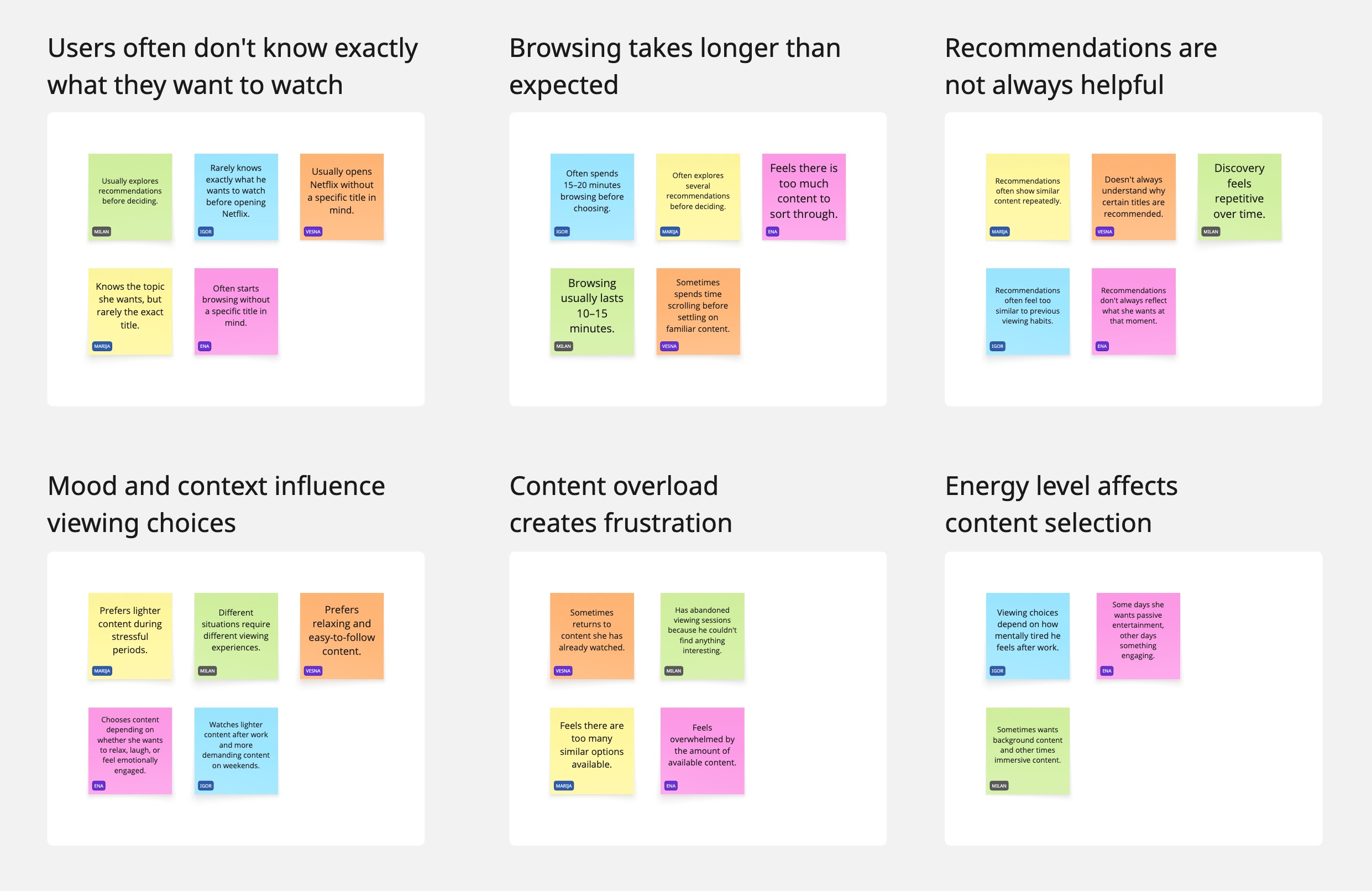
After completing the interviews, I organized participants’ responses into an affinity map to identify recurring themes, behaviors, and pain points. Grouping similar observations revealed clear patterns in how users discover content, make viewing decisions, and experience Netflix’s recommendation system. These themes helped prioritize user needs and informed the direction of the final solution.
Users Often Don’t Know Exactly What They Want to Watch
Most participants opened Netflix without a specific title in mind. Instead, they started browsing with only a general idea of the type of experience or mood they were looking for.
Browsing Takes Longer Than Expected
Participants frequently spent 10–20 minutes searching before making a decision. Exploring multiple categories and recommendations often delayed the start of their viewing experience.
Recommendations Aren’t Always Helpful
While users appreciated personalized suggestions, many felt that recommendations became repetitive over time and didn’t always reflect what they wanted to watch in that particular moment.
Mood and Context Influence Viewing Choices
Participants explained that their content preferences changed depending on factors such as mood, time of day, stress level, or whether they were watching alone or with others.
Content Overload Creates Frustration
The abundance of available content often led to decision fatigue. Some users became overwhelmed by the number of options and occasionally abandoned browsing without selecting anything.
Energy Level Affects Content Selection
Users described choosing different types of content based on their mental energy. After a long day, they preferred light, effortless entertainment, while at other times they were more interested in engaging or thought-provoking content.
Problem Statement
After synthesizing the research findings, I defined the core user problems to ensure the design remained focused on real user needs. These problem statements summarize the primary challenges identified throughout the research and served as a foundation for the proposed solution.
Problem Statement 1
Emma, a frequent streaming user, often opens Netflix without a specific title in mind and spends significant time browsing before making a decision. The large amount of available content makes it difficult for her to quickly identify something that feels relevant, resulting in frustration, decision fatigue, and a less enjoyable viewing experience.
Problem Statement 2
Emma relies on Netflix recommendations to discover new content, but she often struggles to find options that feel interesting or relevant in the moment. As a result, she spends more time searching than watching, which reduces her satisfaction with the content discovery experience.
User Persona
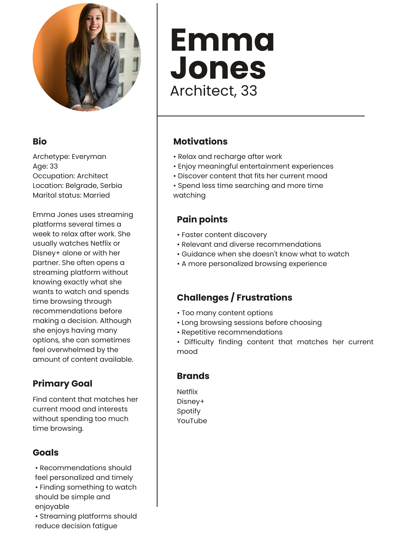
Based on the interview findings and affinity mapping exercise, I created a primary persona representing users who frequently experience decision fatigue when browsing streaming platforms. Emma embodies the shared behaviors, goals, and frustrations identified during the research and served as a reference point throughout the design process.
Her needs helped prioritize features that reduce browsing time, improve content discovery, and deliver recommendations that better reflect users’ current mood and context.
Information Architecture
With the core user needs defined, I focused on structuring the experience around a simple and intuitive journey. Rather than introducing a completely new navigation system, the goal was to integrate Pick for My Mood into Netflix’s existing interface, ensuring the feature felt familiar and easy to access.
The information architecture prioritizes a clear path from discovering the feature to selecting a mood, refining preferences, and receiving personalized recommendations with minimal effort.
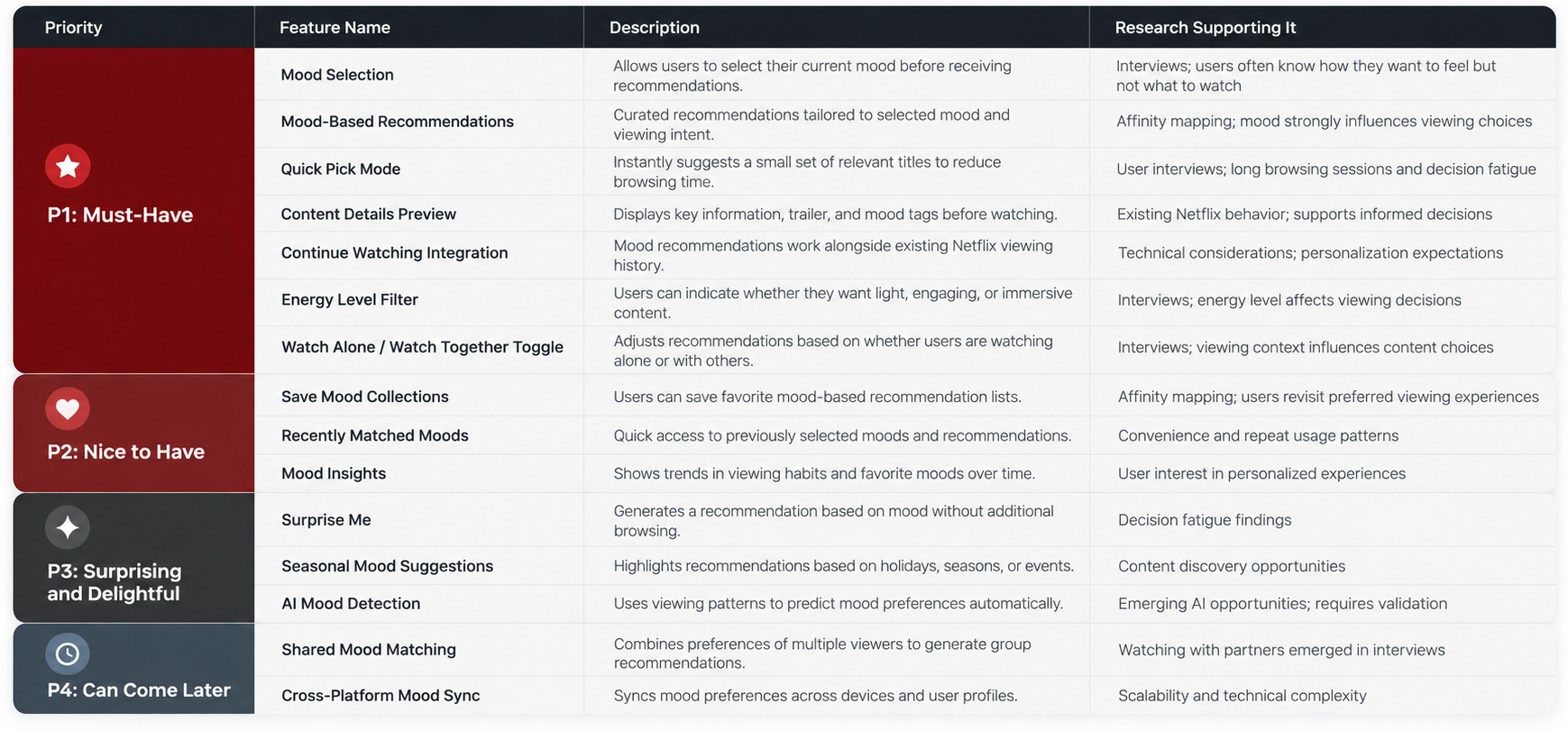
Feature Roadmap
To translate the research findings into a focused product direction, I prioritized features based on their potential to reduce decision fatigue and make content discovery feel more personal and intuitive. The roadmap separates the core features needed to support mood-based recommendations from enhancements that could strengthen personalization and engagement over time. This helped define the initial experience while identifying opportunities for future iterations.
Core Flows
Mapping the User Journey
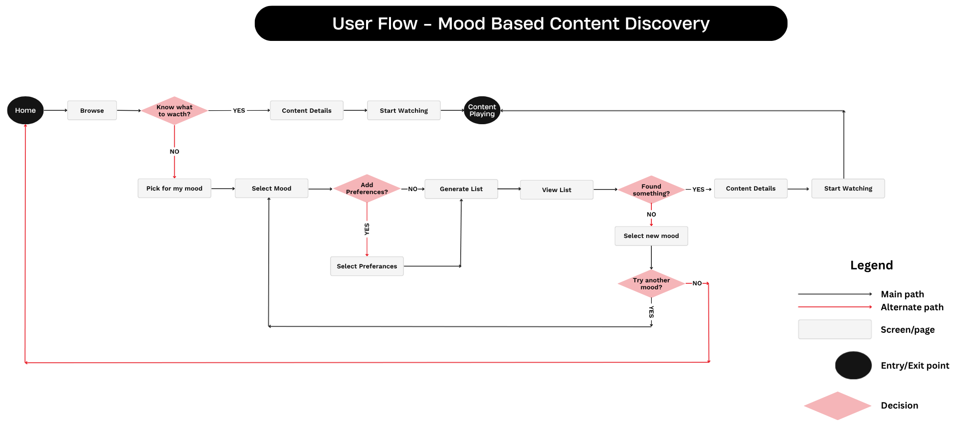
To visualize how users would interact with the new feature, I created a user flow that maps the complete journey from browsing content to receiving personalized recommendations based on mood. The flow helped identify key decision points, ensure a seamless integration with Netflix’s existing experience, and validate that users could easily navigate between the standard browsing path and the new mood-based discovery feature.
The flow includes one primary journey supported by alternative paths that allow users to refine recommendations, explore a different mood, or continue browsing until they find content that fits their needs.
Primary Flow
Users who already know what they want to watch can continue using Netflix’s existing browsing experience, moving directly from content discovery to playback.
Mood-Based Discovery Flow
Users who are unsure what to watch can access Pick for My Mood, select their current mood, optionally refine their preferences, and receive personalized recommendations. If they don’t find a suitable title, they can easily explore another mood without restarting the entire process.
User Flows
To translate the research findings into a seamless experience, I created a user flow that maps the complete journey from content discovery to playback. The flow illustrates how users can either continue with Netflix’s existing browsing experience or access the new Pick for My Mood feature when they are unsure what to watch.
By mapping key decision points and alternative paths, I ensured that the new feature integrates naturally into Netflix’s existing ecosystem while allowing users to quickly discover personalized recommendations based on their current mood and preferences.
Design Exploration
With the user flow defined, I began exploring different ways to introduce the Pick for My Mood feature while staying true to Netflix’s existing experience. The goal was to create a solution that felt intuitive, required minimal learning, and blended seamlessly into the platform’s established design patterns.
During this phase, I explored multiple layouts, navigation approaches, and interaction patterns before refining the concept into wireframes. Each iteration focused on reducing decision fatigue, simplifying the selection process, and making mood-based content discovery feel like a natural part of the Netflix experience.
Wireframes
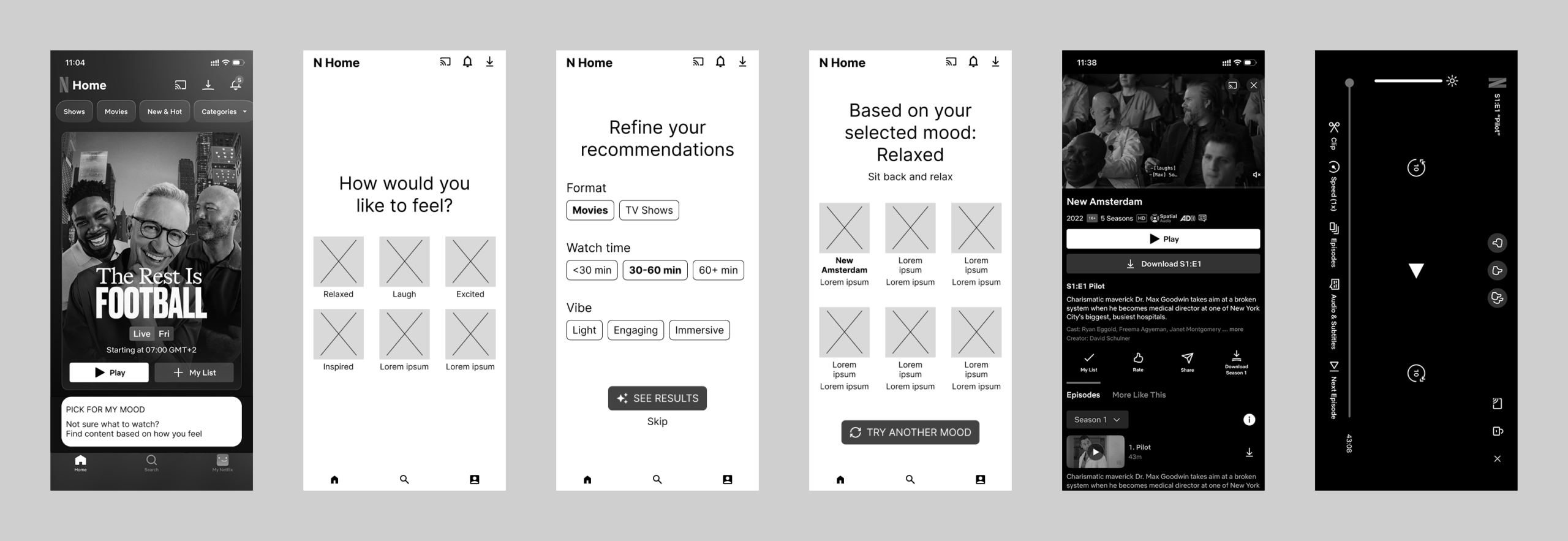
Building on the design exploration, I translated the concept into wireframes to define the feature’s structure, user interactions, and content hierarchy. This stage allowed me to establish the overall experience before focusing on visual details, ensuring that each screen supported a clear and intuitive user journey.
Usability testing played an important role in refining the design throughout both the mid-fidelity and high-fidelity stages. Feedback from five participants in each testing round helped me identify usability issues and make targeted improvements, including simplifying mood selection, clarifying optional preferences, improving the visibility of the feature, and providing more context for personalized recommendations. These iterations helped strengthen the clarity and usability of the overall experience.
Low-Fidelity Wireframes
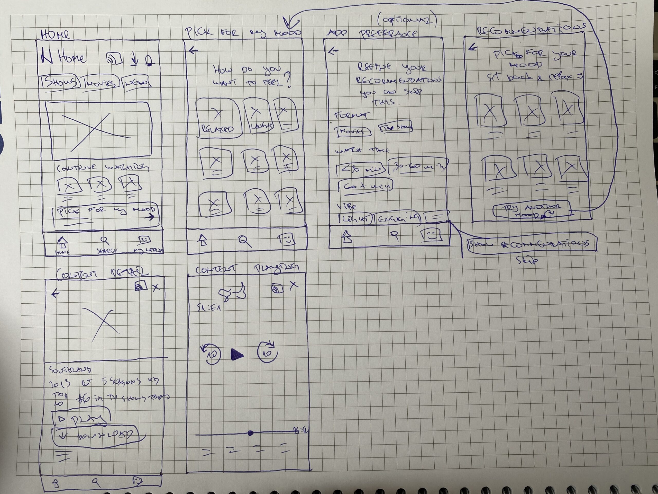
The design process began with low-fidelity sketches to quickly explore ideas and map out the core user journey. At this stage, the focus was on feature placement, screen hierarchy, and navigation rather than visual design.
Sketching allowed me to experiment with different ways of introducing the Pick for My Mood feature, defining the mood selection flow, optional preference filters, and recommendation screens before moving into digital wireframes. By validating the overall structure early, I was able to refine the experience efficiently in later design stages.
Mid-Fidelity Wireframes
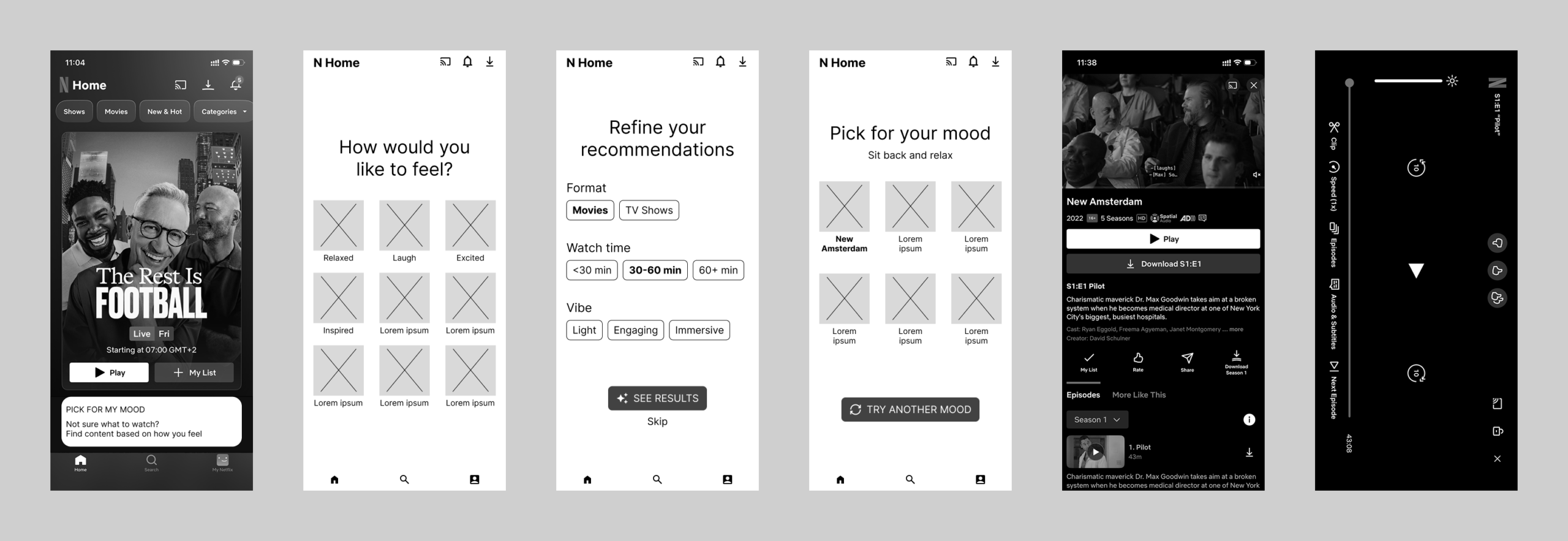
After validating the initial concepts, I translated the sketches into mid-fidelity wireframes to refine the layout, interaction flow, and content hierarchy. This stage focused on creating a more realistic representation of the feature while keeping the design free from visual distractions.
The mid-fidelity prototype was used for moderated usability testing, allowing me to evaluate navigation, identify usability issues, and gather feedback before moving on to the final visual design. The insights collected during testing directly informed the improvements made in the high-fidelity prototype.
Mid-Fidelity Usability Testing
To validate the user flow before moving into visual design, I conducted moderated usability testing with five participants using the mid-fidelity prototype. The sessions focused on evaluating whether participants could successfully navigate the new Pick for My Mood feature, understand its purpose, and complete the core tasks without being influenced by visual styling.
The sessions focused on the overall usability of the experience, helping identify opportunities to improve navigation, interaction clarity, and content discovery before developing the final high-fidelity interface.
Before & After
After validating the initial concepts, I translated the sketches into mid-fidelity wireframes to refine the layout, interaction flow, and content hierarchy. This stage helped me create a more realistic representation of the feature while keeping the design free from visual distractions.
The following comparisons show how I refined the design in response to usability testing, addressing specific issues in mood selection, recommendation clarity, and content discovery.
1. Simplifying Mood Selection
Before: The screen presented too many mood options, making them harder to scan.
After: I reduced the number of mood options from nine to six, making the selection process simpler and faster.
2. Clarifying Recommendations
Before: Users received recommendations without enough context about why the content was suggested.
After: I added the message “Based on your selected mood: Relaxed” to explain the connection between the selected mood and the recommendations.
3. Improving Content Discovery
Before: Recommendation cards provided limited context to help users decide what to watch.
After: I refined the recommendation experience to make content suggestions easier to understand and evaluate.
Visual Direction
Since this project introduces a new feature within an existing product, the goal was not to create a new visual identity but to design a solution that feels native to Netflix. Throughout the process, I followed Netflix’s established design language, including its typography, color palette, spacing, navigation patterns, and UI components, to ensure a seamless and familiar user experience.
By maintaining consistency with the existing interface, the Pick for My Mood feature integrates naturally into the platform while introducing a new, personalized way to discover content.
High-Fidelity Design
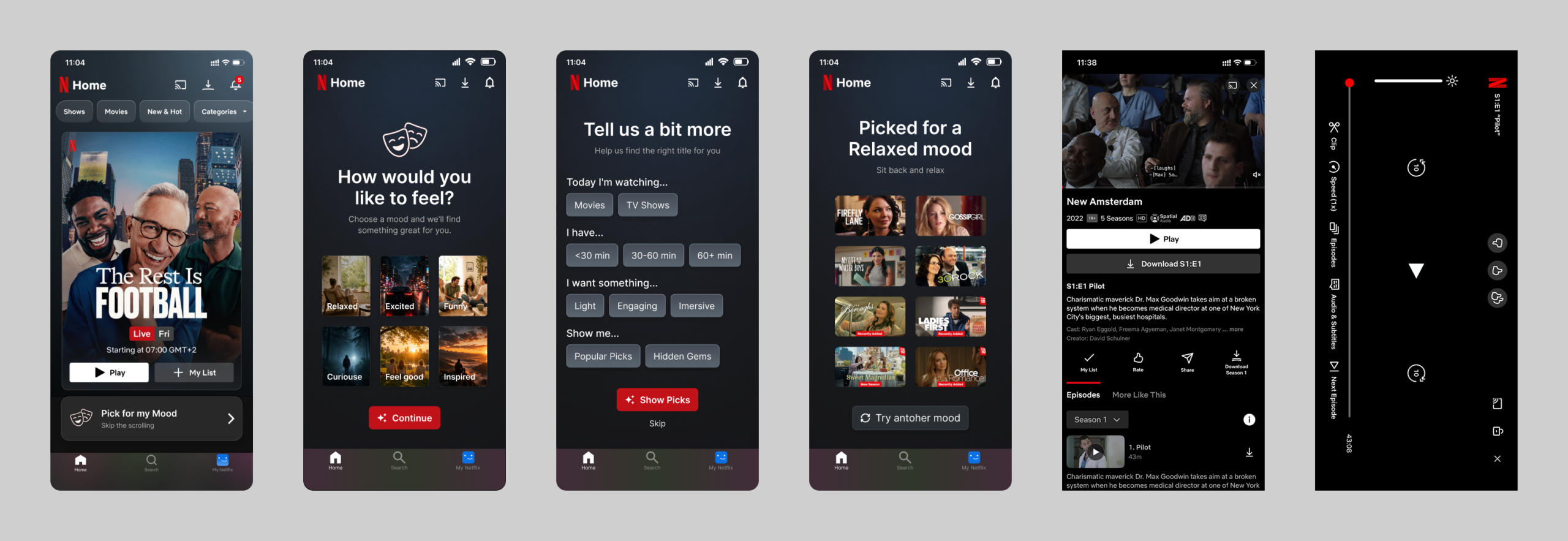
With the interaction flow validated and the visual direction established, I developed the final high-fidelity designs. The focus was on creating a polished interface that integrates seamlessly into Netflix’s existing ecosystem while making the new Pick for My Mood feature feel intuitive and familiar. The final screens combine insights from user research, usability testing, and iterative design improvements to deliver a streamlined content discovery experience that helps users find something to watch faster and with greater confidence. This prototype brings together the complete user journey, from discovering the feature to selecting a mood, refining preferences, and receiving personalized recommendations, and served as the version used for usability testing.
High-Fidelity Usability Testing
The high-fidelity prototype was tested with five participants to evaluate the complete mood-based discovery flow, from finding Pick for My Mood to selecting preferences, reviewing recommendations, and starting playback.
The usability testing sessions validated the overall concept and confirmed that participants found the Pick for My Mood feature intuitive and easy to use. Users were able to complete the primary tasks successfully, demonstrating that the mood-based discovery flow felt natural within Netflix’s existing experience.
The feedback also highlighted several opportunities for refinement, including improving the visibility of the feature on the Home screen, clarifying that preference filters were optional, and providing additional context for personalized recommendations. These insights informed the final design iterations and helped create a more intuitive and user-centered experience.
Testing Results
The usability test confirmed that participants could successfully complete the mood-based discovery flow and quickly understand the purpose of the Pick for My Mood feature. Overall, users found the experience intuitive, useful, and well integrated into the existing Netflix interface.
While the core concept was validated, testing also uncovered several opportunities to improve clarity and usability. The findings below highlight the most significant observations and informed the final design refinements that strengthened the overall user experience.
Iterations & Key Improvements
Based on the testing findings, I made targeted refinements to address specific usability issues while preserving the core functionality of the feature. The following improvements focus on making preference selection clearer, recommendations easier to understand, and the feature easier to discover.
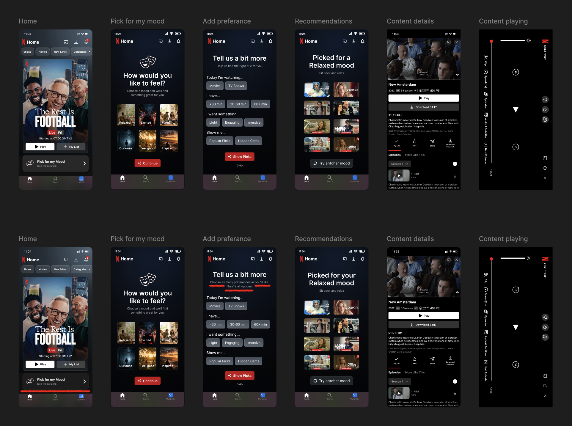
Clarifying Multiple Selection
Several participants hesitated because they were unsure whether they could select more than one preference within each category. To reduce uncertainty, I updated the supporting text to clearly communicate that users could choose one or multiple preferences, making the interaction more intuitive from the start.
Clarifying That Preferences Are Optional
Some participants assumed they had to make a selection in every category before continuing. To create a more flexible experience, I added helper text explaining that preferences are optional, allowing users to proceed directly to recommendations if they preferred.
Improving Feature Discoverability
During testing, some participants initially overlooked the Pick for My Mood feature on the Home screen because their attention was drawn to the featured content. I addressed this by increasing the visual prominence of the feature, making it easier to discover while maintaining consistency with Netflix’s existing interface.
Before & After
The following comparisons illustrate how participant feedback shaped the final design. Each refinement was driven by usability testing and focused on improving clarity, reducing uncertainty, and making the Pick for My Mood experience more intuitive. While the overall concept remained the same, these small, targeted changes resulted in a smoother and more user-friendly interaction.
The changes are highlighted in red on the After screens to make the improvements easier to identify.
Impact
The project explored how mood-based recommendations could help Netflix users overcome decision fatigue and find content that matches their current needs. Usability testing with five participants at both the mid-fidelity and high-fidelity stages helped validate the concept and identify opportunities to improve the experience.
The findings informed targeted refinements to mood selection, optional preferences, feature discoverability, and recommendation clarity. Together, these improvements strengthened the usability of the proposed feature while preserving the familiar Netflix experience.
Final Prototype
The final interactive prototype brings together the complete Pick for My Mood experience, from discovering the feature and selecting a mood to refining preferences, exploring recommendations, and opening a title.
Explore the prototype below to see how the feature works within Netflix’s existing interface.
Reflection
Designing a feature for an established product like Netflix challenged me to think beyond creating new functionality. Every design decision needed to balance innovation with familiarity, ensuring that the new experience felt like a natural extension of the existing platform rather than a separate product.
This project reinforced the importance of grounding design decisions in user research and validating ideas through usability testing. Seeing participants interact with the prototype highlighted how thoughtful iteration and small interface refinements can significantly improve the overall user experience.
Working within an existing design system also strengthened my ability to solve user problems while respecting established patterns, demonstrating that meaningful innovation often comes from enhancing familiar experiences rather than reinventing them.